Report Design
Thurrock Mitigation Benefits Report
Client
Thurrock Council (via Hatch)
Industry
Municipal Government
My Role
Lead Designer
Location
United Kingdom
The Project
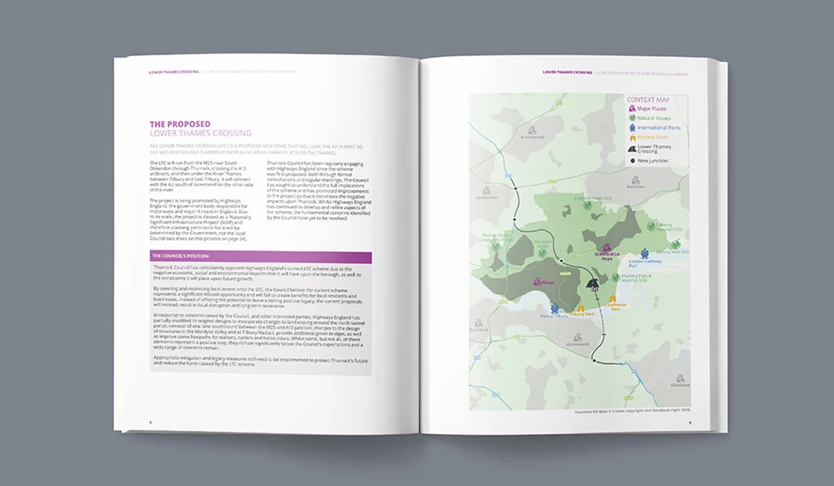
Thurrock Council required a non-technical public summary of the mitigation benefits associated with the Lower Thames Crossing, a major infrastructure initiative with wide-ranging environmental implications.
The document needed to communicate a large volume of technical environmental findings to a diverse audience of public and private stakeholders, many of whom did not have specialist backgrounds in environmental assessment or infrastructure planning.
The design challenge was to make the information feel clear, navigable, and credible without oversimplifying the content or reducing the technical rigour behind it.
The Thinking
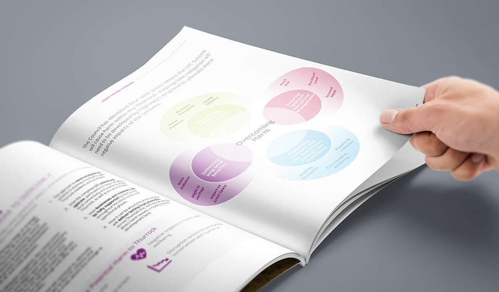
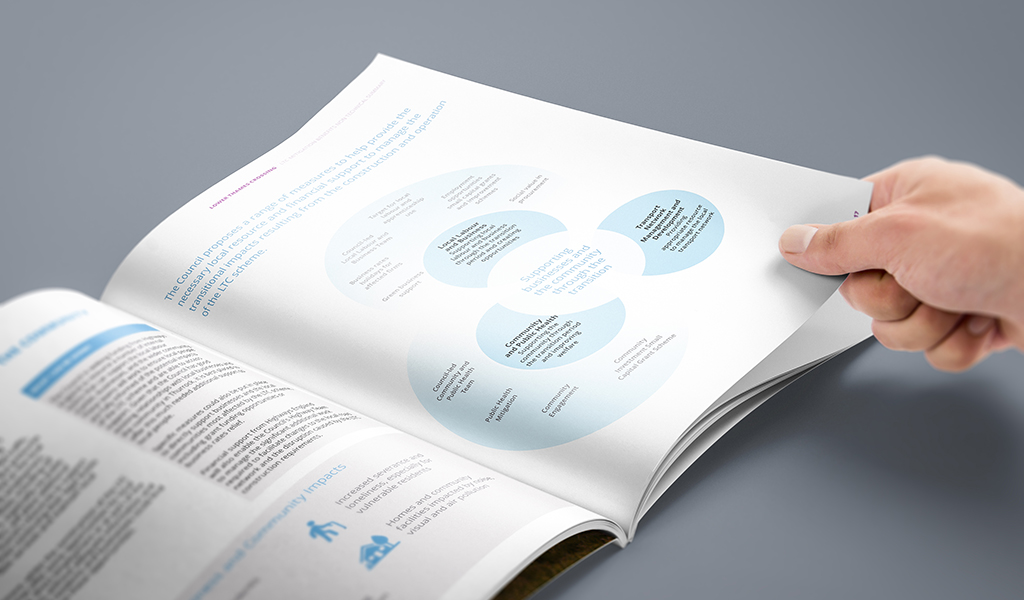
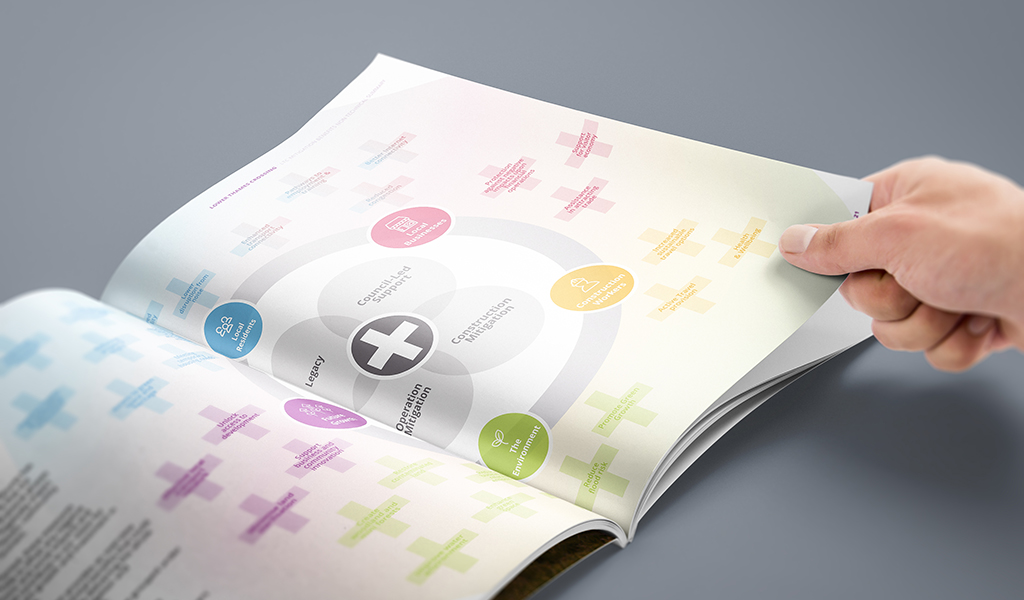
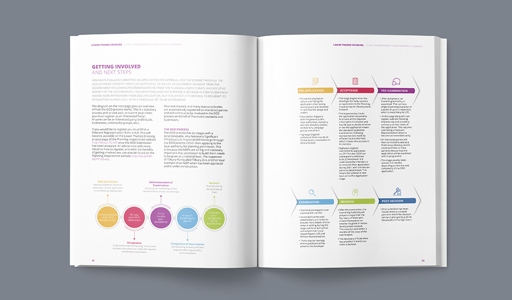
The primary design challenge was navigation.
With four distinct mitigation strategies running throughout the document, readers needed a way to track specific themes across dense content without losing their place or their thread. I developed a colour-coded system to differentiate each strategy, creating a persistent visual reference that allowed readers to follow one theme through the document or move between related sections with confidence.
Custom iconography served as a second layer of orientation. Icons marked key impacts, project milestones, and recurring content types, helping readers identify important information quickly and reducing the cognitive load of working through technical material.
The goal was to make the report feel like a guided reading experience rather than a static reference document. The visual system gave structure to the content, supported public comprehension, and helped technical findings remain accessible to a wider stakeholder audience.
What This Demonstrates