Logo Design
The Crossing — Community Event Branding
Client
Halton Region Heritage Services / Town of Oakville
Industry
Municipal Government / Community Heritage
My Role
Sole Designer / Creative Strategist
Location
Canada
The Project
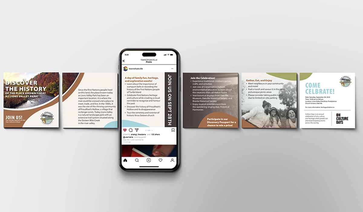
The Crossing is an annual community heritage event held at Lions Valley Park in Oakville as part of Canada’s national Culture Days initiative.
Halton Region Heritage Services needed a distinct visual identity that would reflect the historical significance and natural character of the site, feel welcoming to a family audience, and build recognition as the event grew year over year.
Since the event launched in 2023, I have produced the full suite of annual event materials, working directly with Halton Region Heritage Services and the organizing team at Knox Presbyterian Church Sixteen.
The Thinking
The core strategic decision was designing for longevity from the outset.
Rather than creating an event identity that would need to be refreshed every year, the goal was to develop a mark specific and flexible enough to anchor the event over multiple seasons. Supporting materials could then carry the year-to-year updates while the core identity remained consistent.
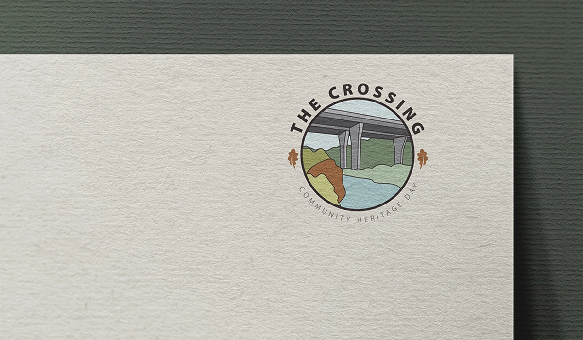
Research into community event identities, outdoor programming, and national park-style branding pointed toward a badge format as the strongest fit. The structure carries familiar associations with heritage, landscape, discovery, and community belonging, making it accessible across age groups without requiring prior knowledge of the site or its history.
The custom bridge illustration at the centre of the badge gave the identity a direct connection to Lions Valley Park. Oak leaves referenced the town’s namesake trees, while the fall colour palette was drawn from the event season and surrounding landscape.
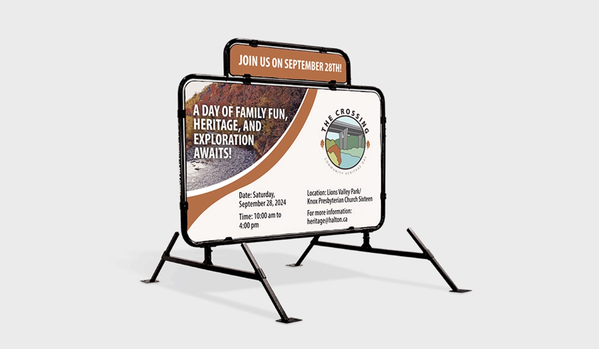
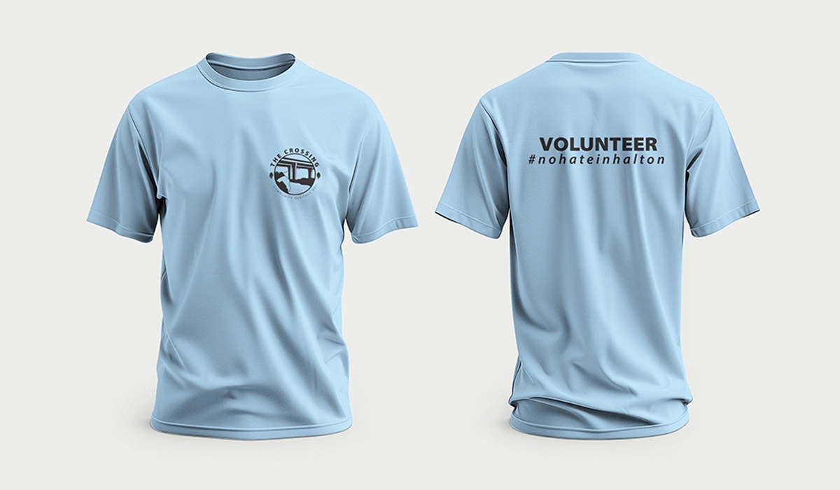
The result is an identity system that has remained stable across three years of programming, allowing recognition to build while posters, signage, social assets, activity passports, and environmental touchpoints keep the event materials fresh each season.
What This Demonstrates