Exhibit Design
CFUW Oakville 75th Anniversary Exhibit
Client
Canadian Federation of University Women, Oakville Chapter via Halton Region Heritage Services
Industry
Non-profit / Municipal Heritage
My Role
Sole Designer
Location
Canada
The Project
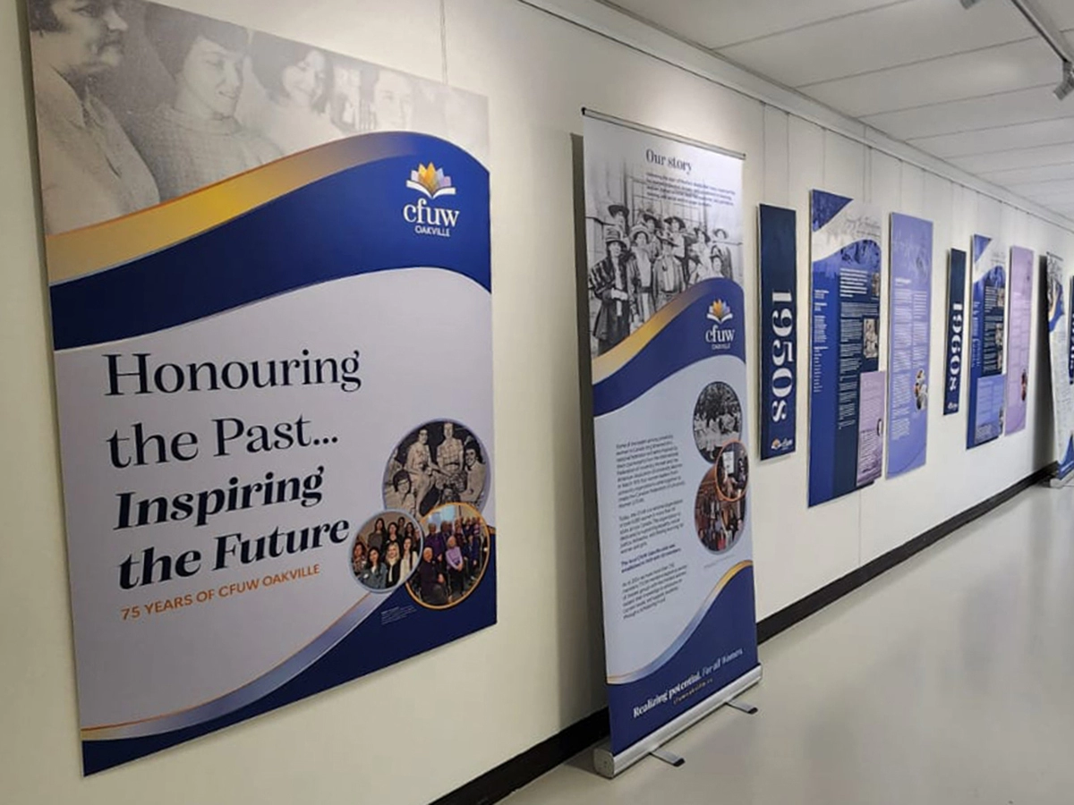
The Canadian Federation of University Women (CFUW) is a national organization dedicated to advancing equality, social justice, and lifelong learning for women and girls. To mark its 75th anniversary, the Oakville Chapter commissioned a commemorative exhibition at QE Park Community and Cultural Centre celebrating its history, members, and public impact.
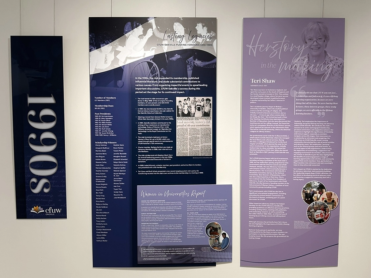
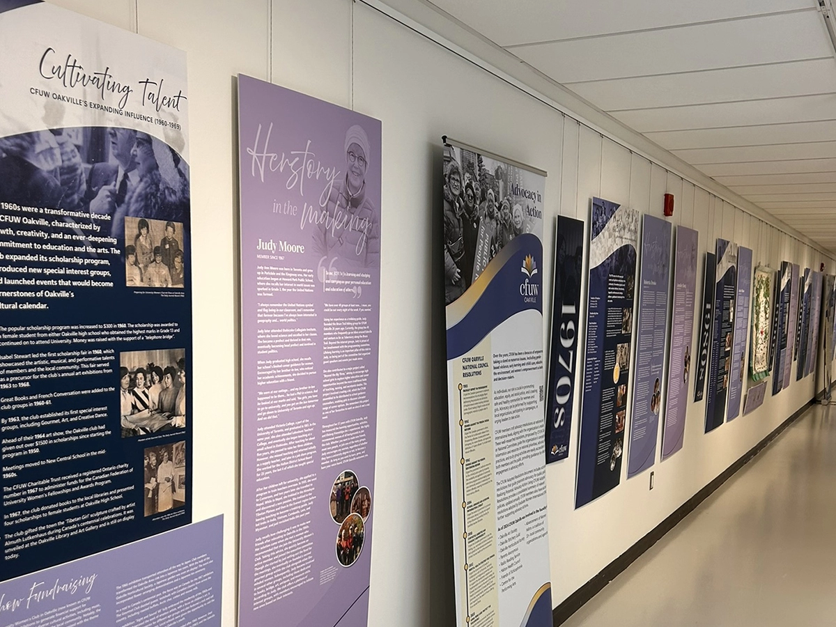
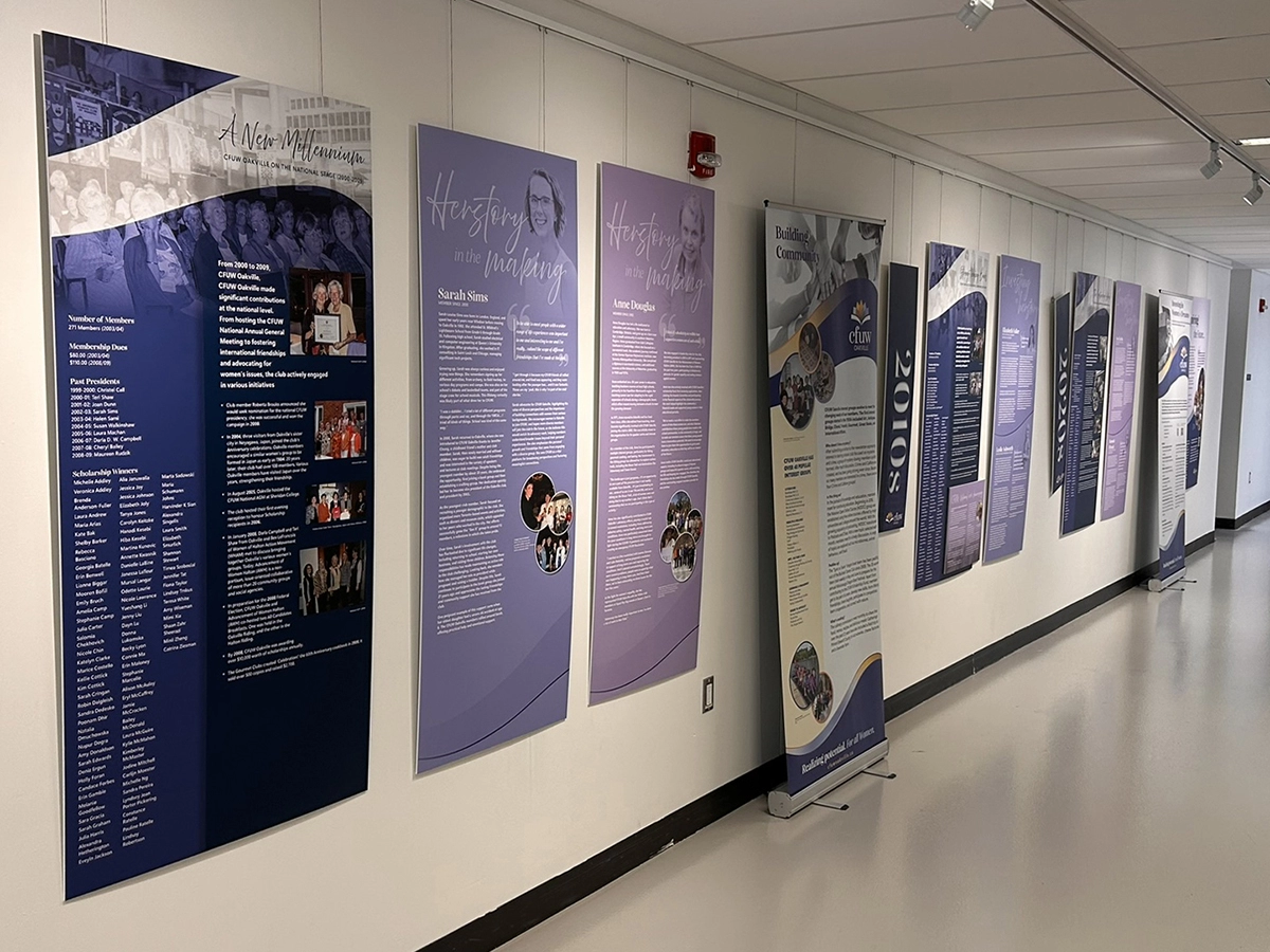
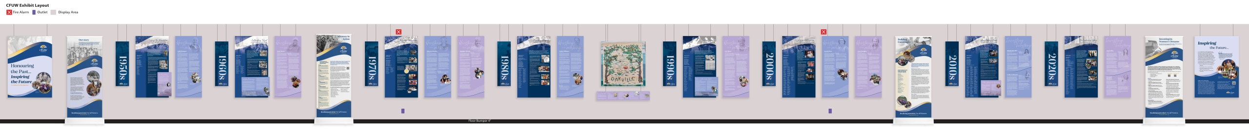
The exhibition was installed in a 94-foot hallway, making the space itself a central part of the brief. The challenge was not simply to design individual panels, but to structure the full experience so the story unfolded clearly as visitors moved through it.
The final approach combined a large timeline with member profiles and raised callouts, creating a clear narrative flow while allowing space for individual voices and historical detail. The visual language adapted CFUW’s existing brand guidelines for exhibition use across panels, banners, callouts, and supporting display elements.
The Thinking
Spatial planning was the foundation of the project.
Rather than designing the panels first and resolving the installation afterward, I mapped the full exhibit layout in Illustrator before panel design began. The spatial mock-up accounted for the track mounting system, physical obstacles, panel sizing, content grouping, and sequencing across the full hallway length.
That planning document became a shared reference point for the client, printer, and installation team. It helped surface constraints early, align expectations, and give everyone a clear picture of the final installation before production began.
Working within CFUW’s established brand guidelines meant the creative work focused on interpretation and application rather than invention. The challenge was to create enough variation across timeline panels, pull-up banners, and raised callout panels to keep the exhibit visually engaging while maintaining a consistent commemorative identity.
The archival image collection introduced another significant design challenge. Source materials ranged from high-quality portraits to low-resolution historical scans that were far below print-ready standard. I developed halftone fades, layered backgrounds, and image treatment strategies to integrate inconsistent photography in a way that felt intentional rather than like a workaround.
Accessibility considerations were built into the design process from the outset. Minimum font sizes, typographic hierarchy, panel placement, and hanging height were considered early so the exhibition could support readability in a public community setting.
Collaboration with the Halton Region Heritage Services team was essential throughout. Their installation experience informed practical decisions around sequencing, mounting, viewing distance, and the realities of designing for a physical public space.
What This Demonstrates