Case Study
CAC-ACCR Rebranding & Marketing Materials
Client
Canadian Association for Conservation of Cultural Property (CAC-ACCR)
Scope of Work
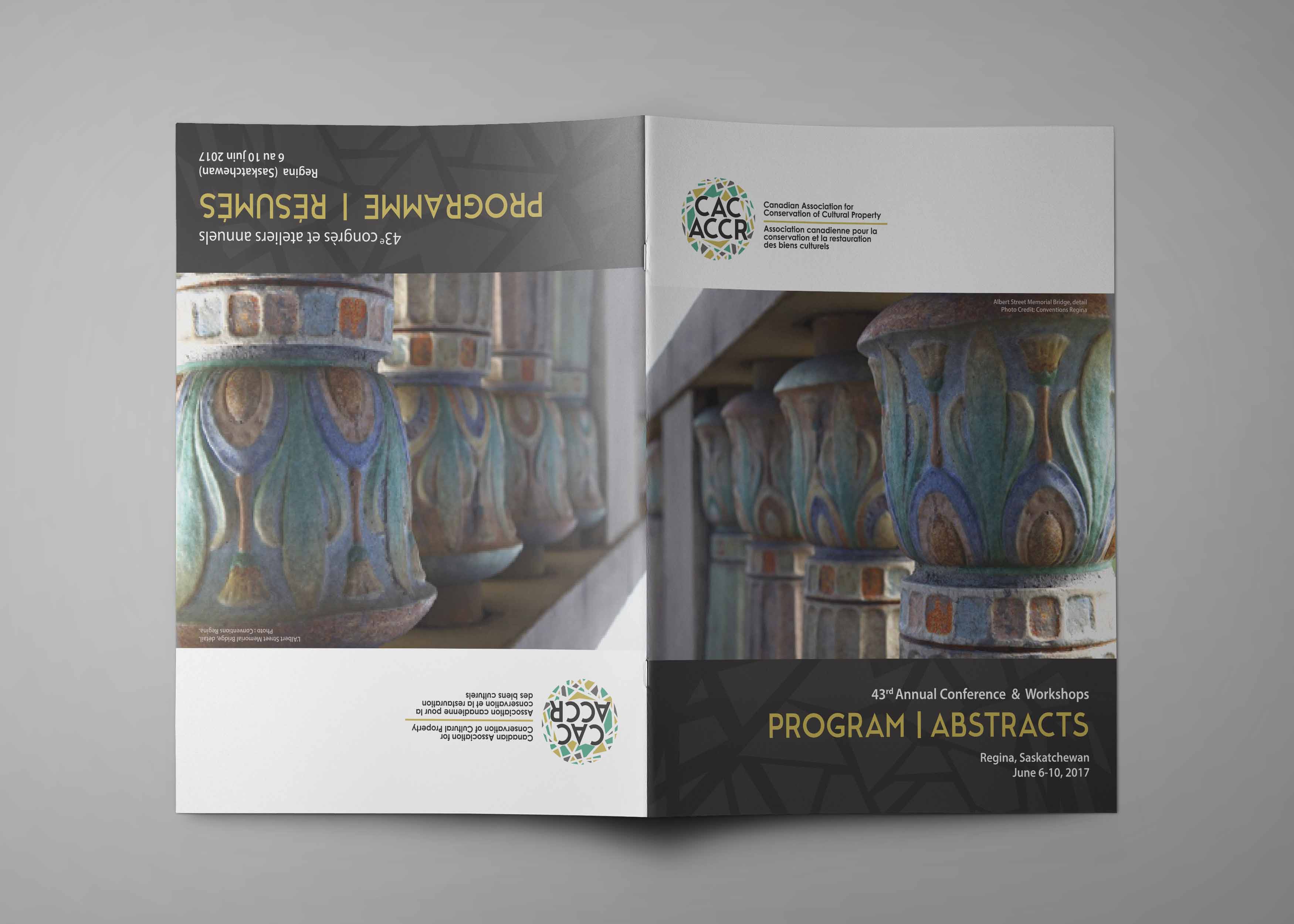
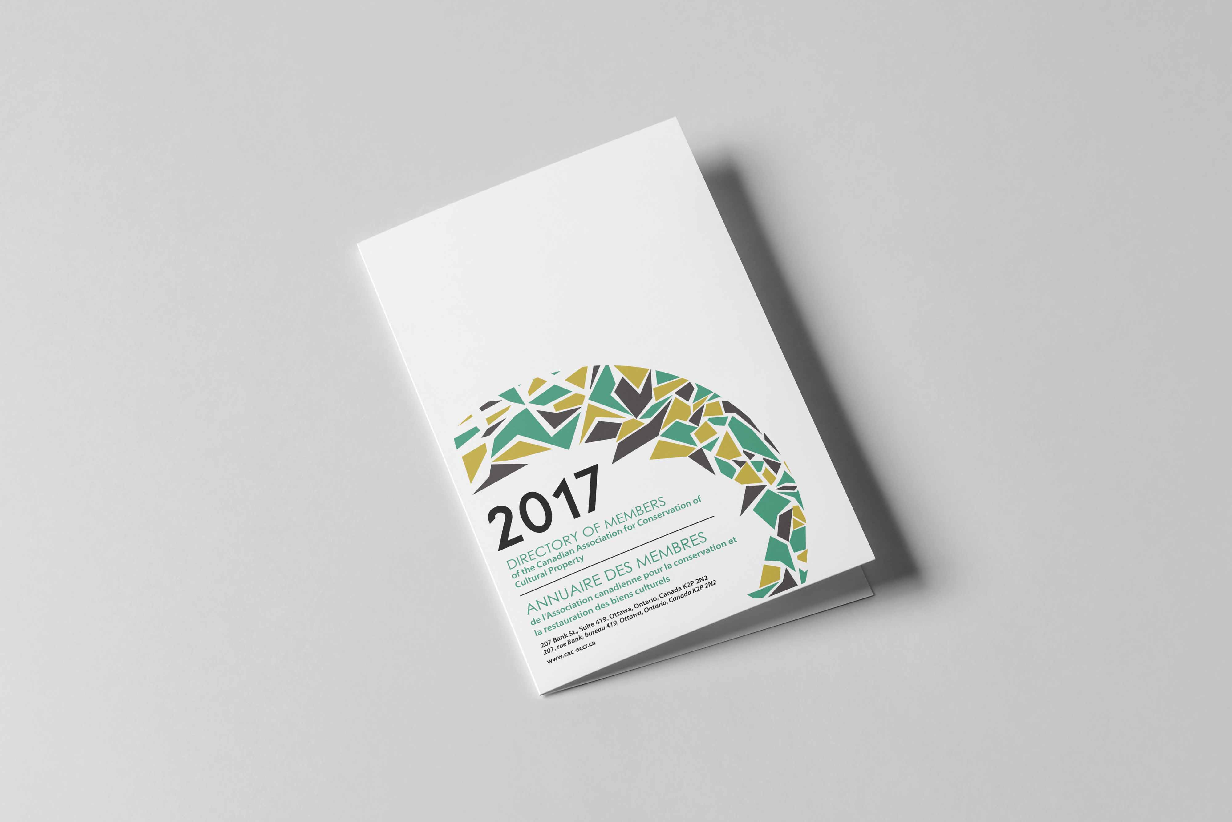
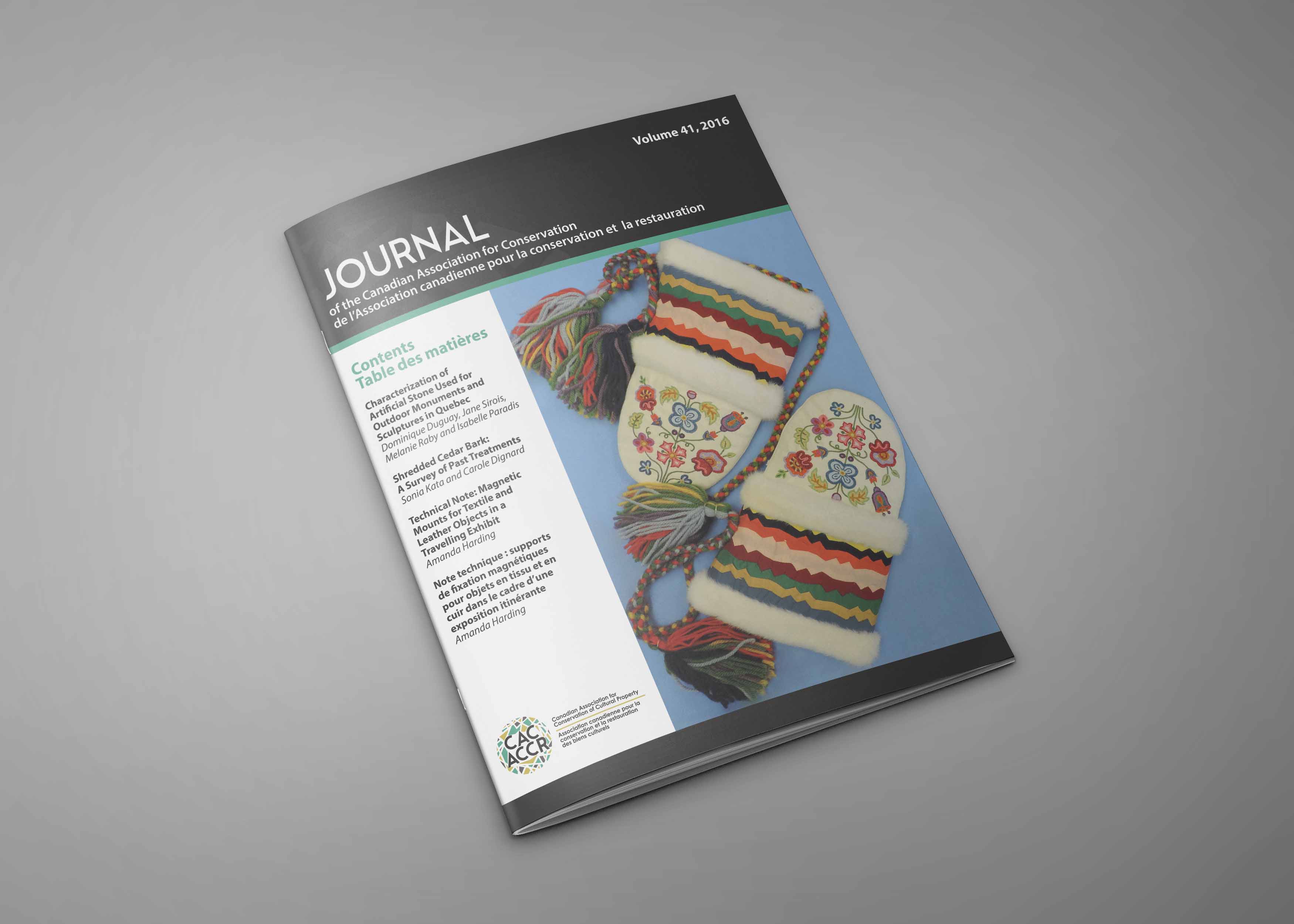
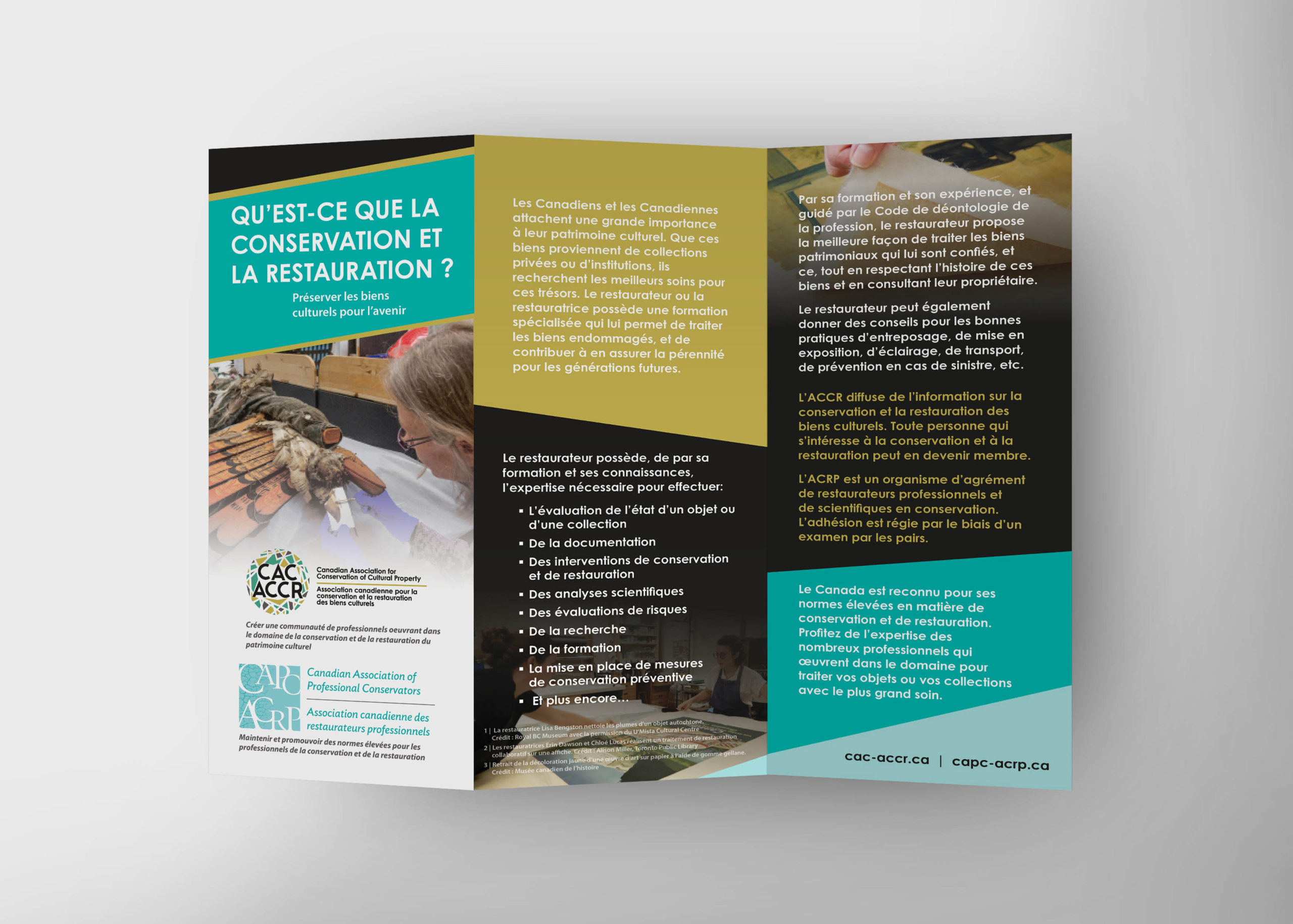
Logo redesign, brand identity, bilingual marketing collateral, annual publication design
Location
Canada
Timeline
One month for the initial rebrand
The Challenge
CAC-ACCR approached me because their existing logo no longer reflected the organization they had become. They needed an identity that felt contemporary and thoughtful, while still representing the breadth of their work.
That breadth was the main challenge. Their membership includes conservators working across paintings, textiles, archaeological artefacts, architectural heritage, and more. The logo had to feel inclusive to everyone, without leaning too far toward any one specialty.
Because the organization operates in both English and French, the identity also had to work cleanly in both languages. Inclusivity was not just part of the message — it was part of the design itself.
The Approach
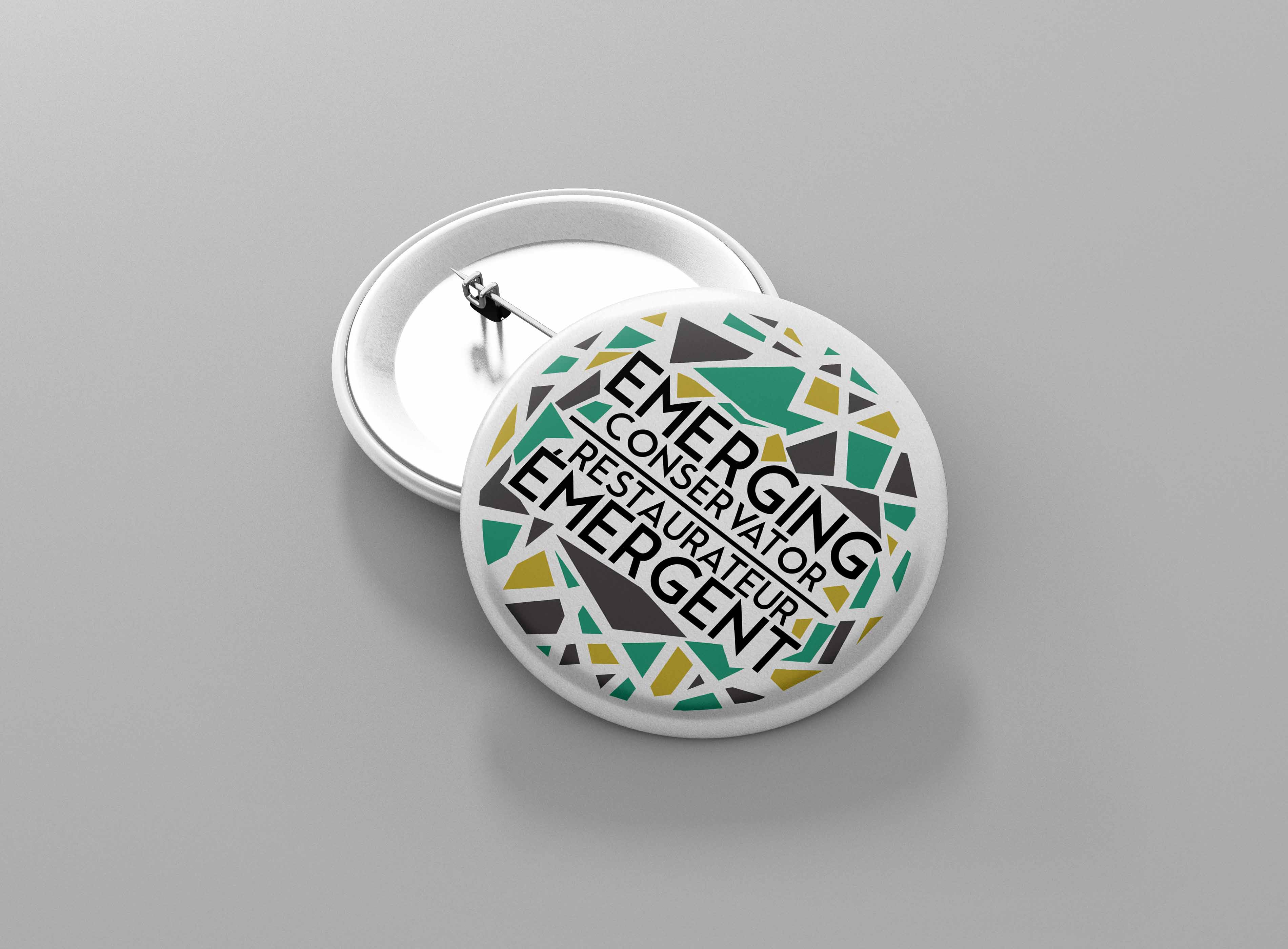
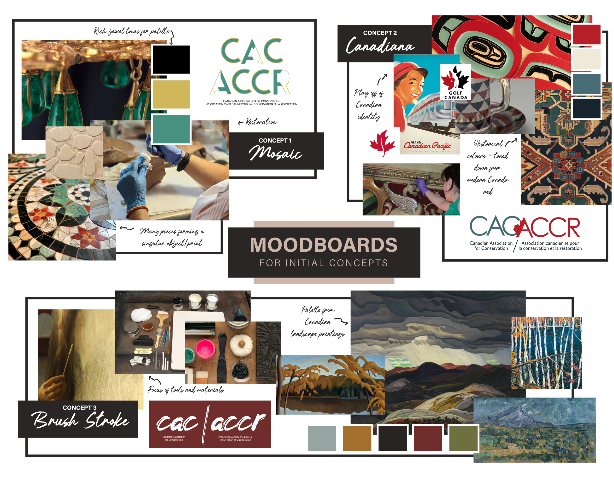
I explored several directions, including concepts rooted in Canadian identity and traditional conservation symbolism. The strongest idea was a circular mark made up of colourful, mosaic-like shards.
It was a strong fit for the organization. Conservation is a field made up of many materials, techniques, and disciplines, and CAC-ACCR brings those perspectives together. The mosaic concept gave that diversity a clear visual form without reducing the organization to any single material or practice.
I also made sure the English and French versions of the logo felt balanced, polished, and equally considered.
Original Logo
Redesign Logo
The Result
The rebrand launched at CAC-ACCR’s 2016 national conference and was introduced to the full membership. The response was enthusiastic, and the organization was pleased to have an identity that finally felt like it reflected their community — contemporary, considered, and true to the breadth of their work.
The relationship has continued ever since, with annual conference materials, journal covers, and ongoing collateral produced year after year.