








Brand & Visual Identity

Case Study

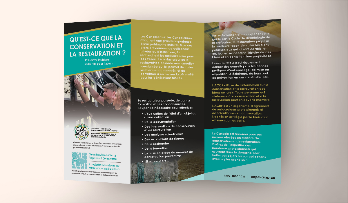
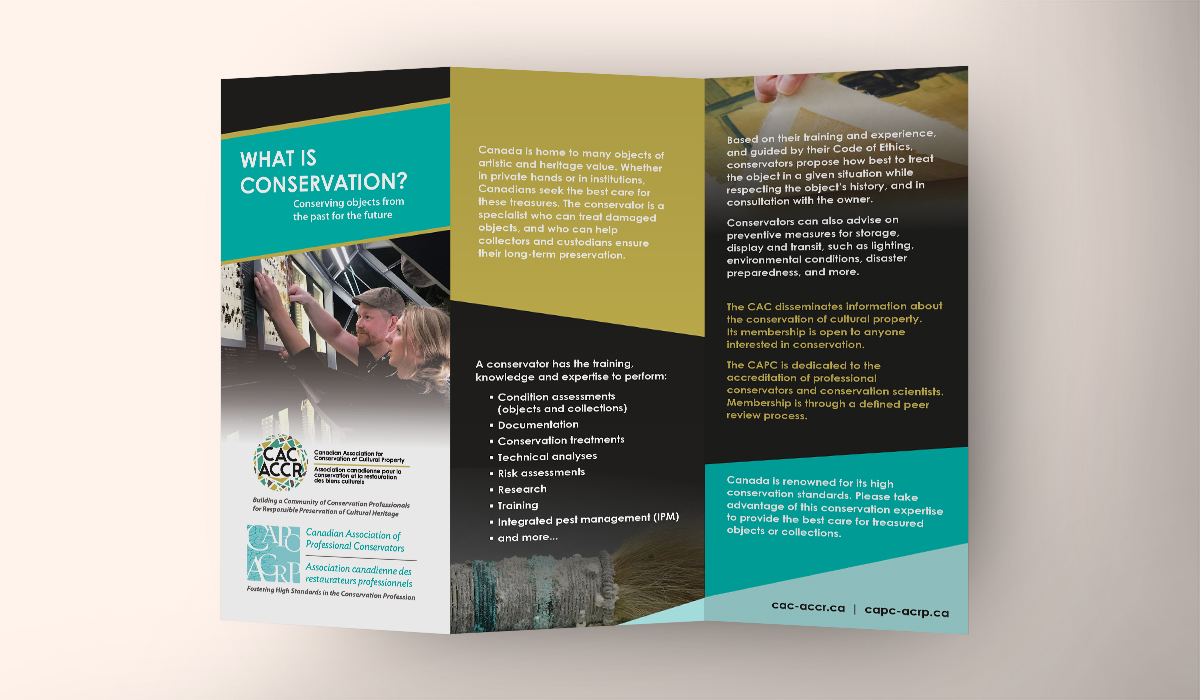
CAC-ACCR Rebranding

A bilingual rebrand that brought a national conservation organization’s diverse disciplines together through a colourful, flexible identity system and collateral.

Mockup of rebranded colour logo for CAC-ACCR on stationery. Showing top left-hand corner on beige background.Mockup of rebranded colour logo for CAC-ACCR on stationery. Showing top left-hand corner on beige background.
Case Study

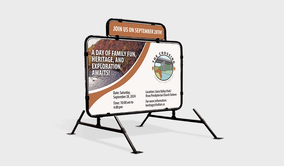
The Crossing

A place-based brand system helped this annual Culture Days event feel welcoming, recognizable, and connected to its Oakville setting.

Signs, Events & Physical Spaces

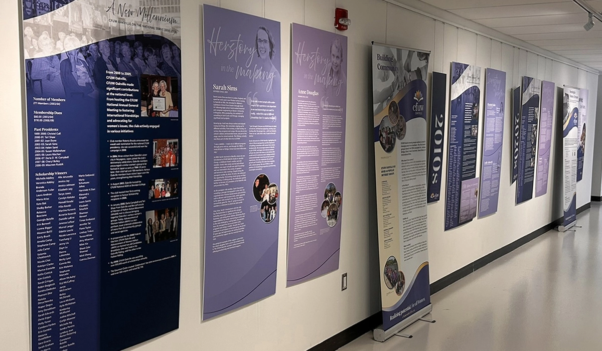
Case Study

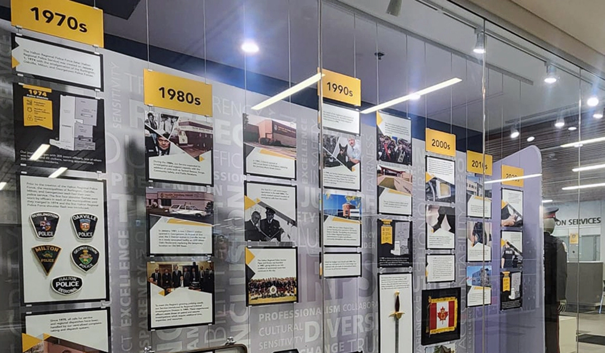
CFUW Anniversary Exhibit

A community exhibit celebrating CFUW Oakville’s 75th anniversary, with timeline panels, thoughtful spatial planning, and creative ways to share archival images.

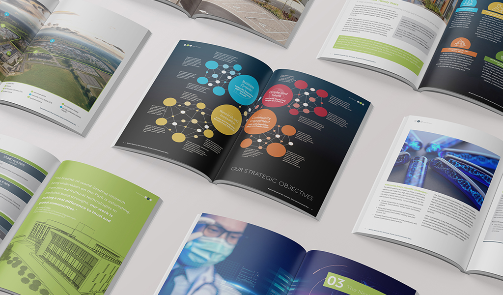
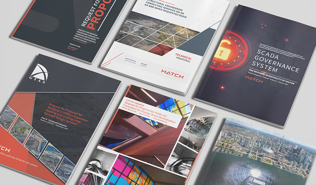
Reports & Proposals

Case Study

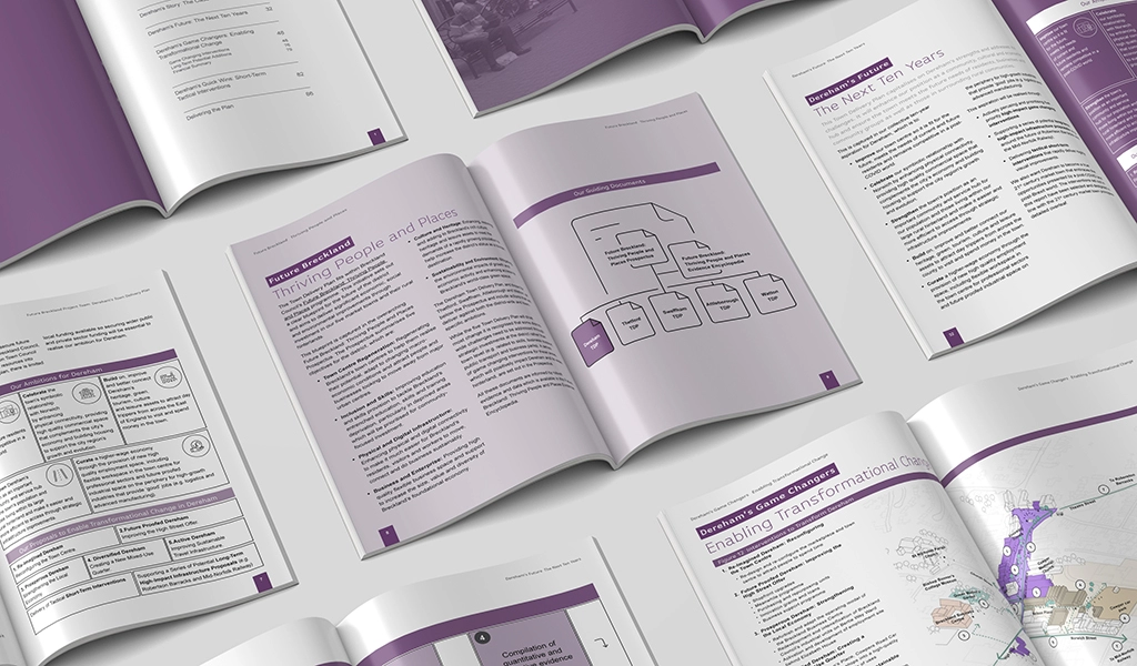
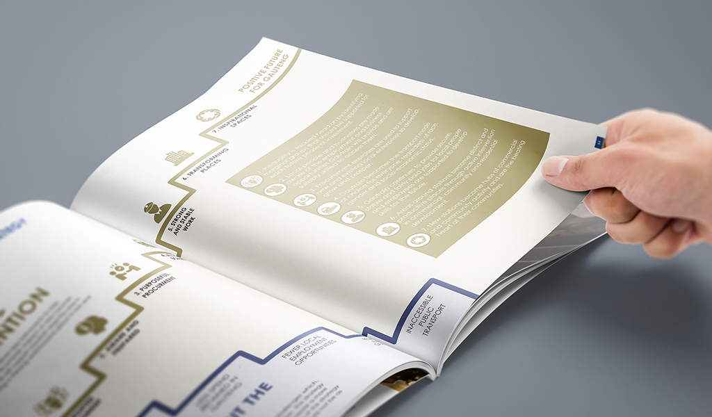
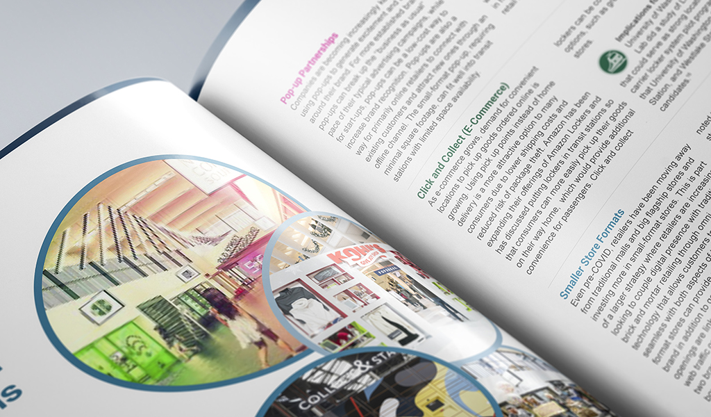
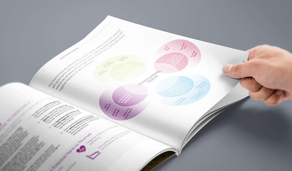
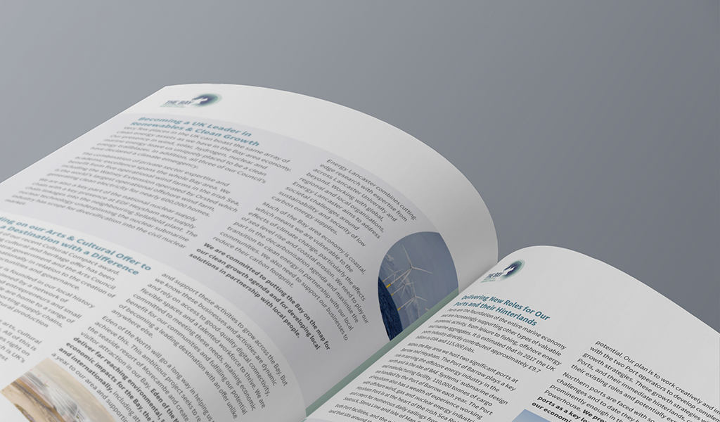
Scarborough Subway Extension

A six-month proposal design effort brought clarity, consistency, and visual structure to a major transit infrastructure submission.

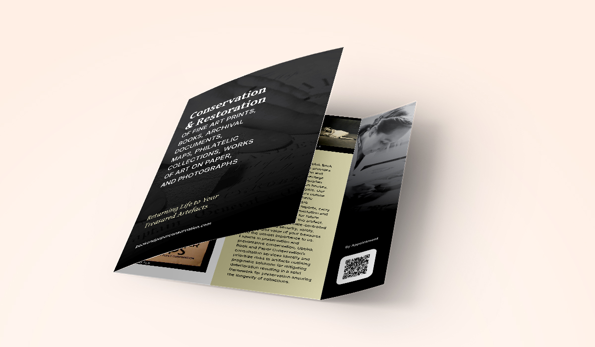
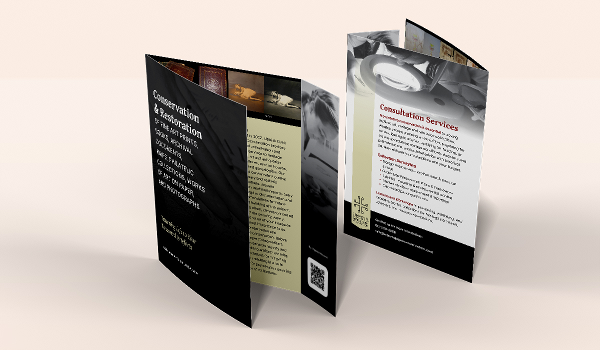
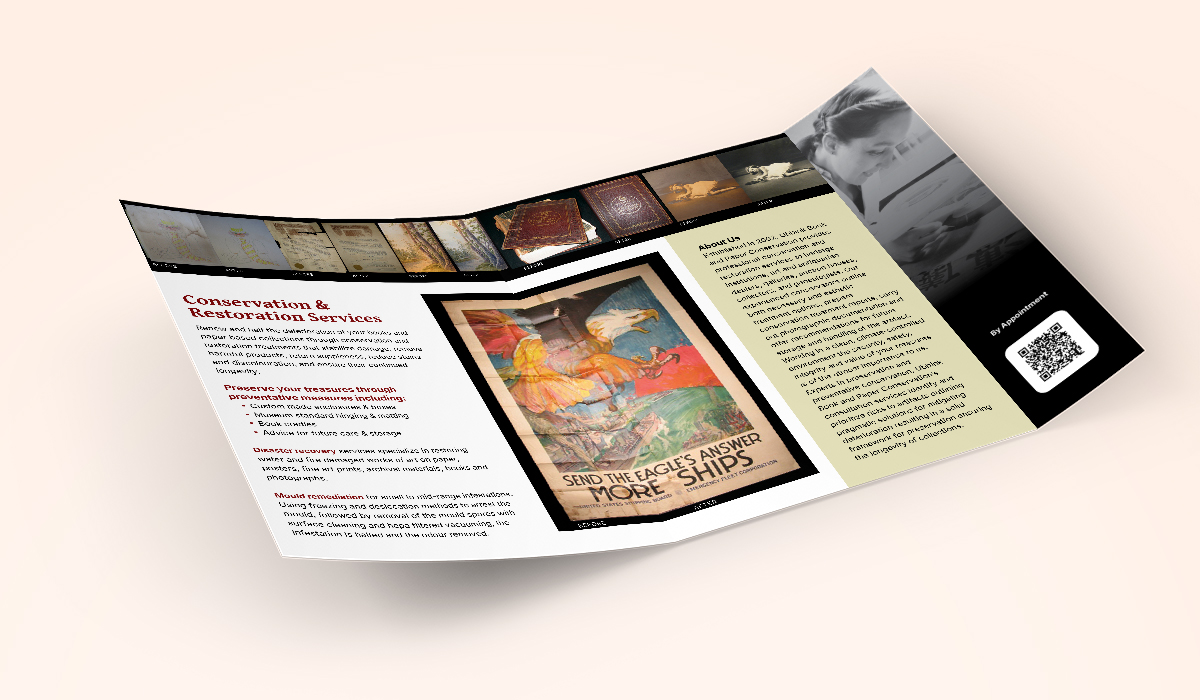
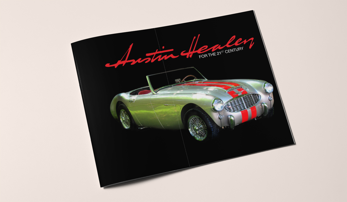
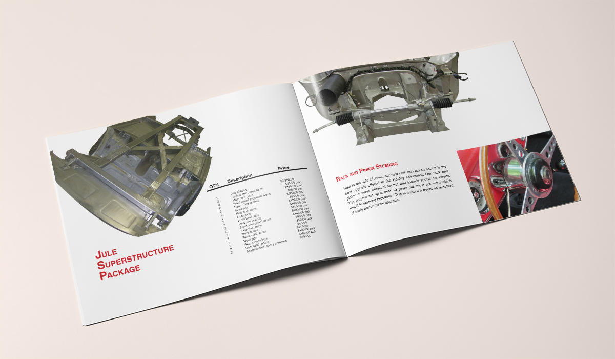
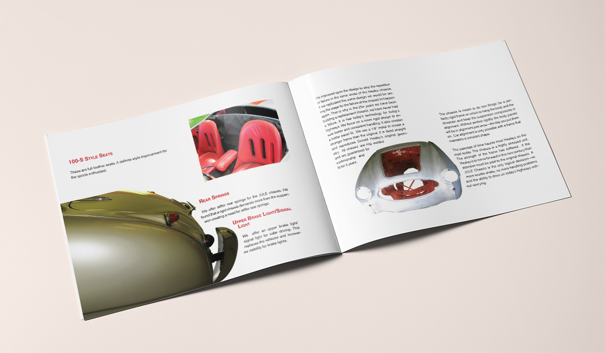
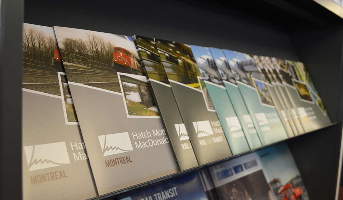
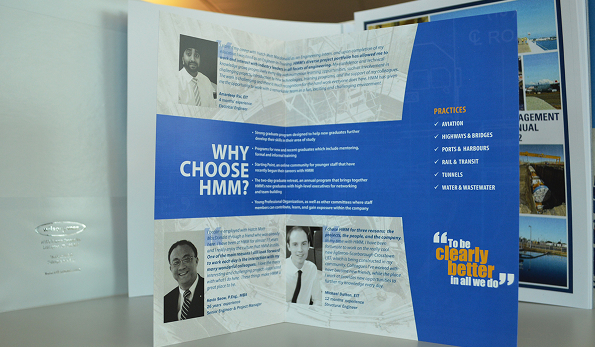
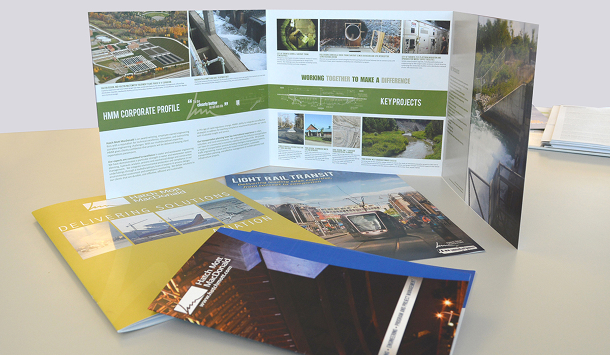
Brochures

Like what you see?

If my work feels like a good fit, send me a few details about your project and I’ll be in touch with next steps.