Logo Redesign
CAC-ACCR Rebranding & Marketing Materials
Client
Canadian Association for Conservation of Cultural Property (CAC-ACCR)
Industry
Non-profit / Cultural Heritage
My Role
Lead Designer / Creative Strategist
Location
Canada
The Project
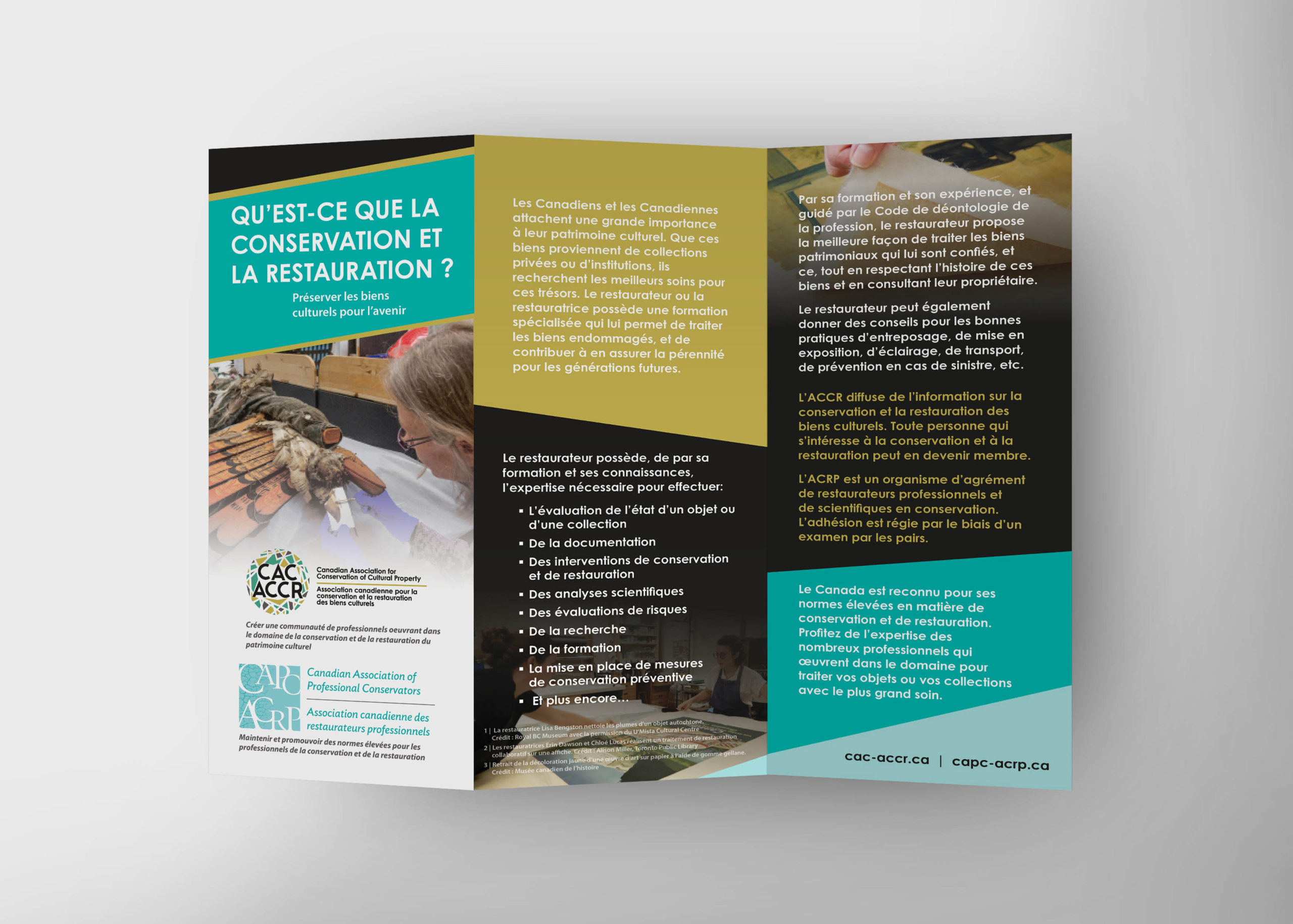
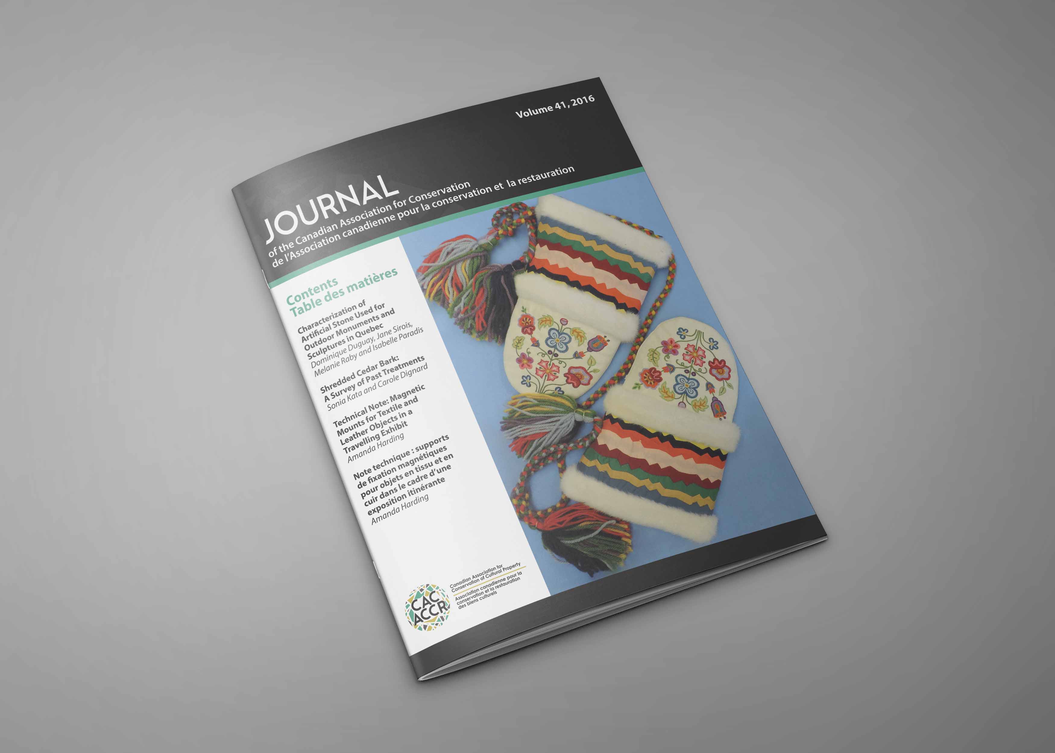
CAC-ACCR is a national non-profit organization representing conservators across an unusually broad range of disciplines, including paintings, textiles, archaeological materials, architectural heritage, and more.
The organization’s existing logo no longer reflected the breadth, sophistication, or professional standing of its membership. The new identity needed to feel relevant to every member, regardless of specialty, while functioning as a fully bilingual brand system where English and French applications carried equal visual weight.
This was not simply a logo refresh. It was a strategic identity project for a national organization with a complex audience, a bilingual communications mandate, and a strong need for visual inclusivity.
Original Logo
New Logo
The Thinking
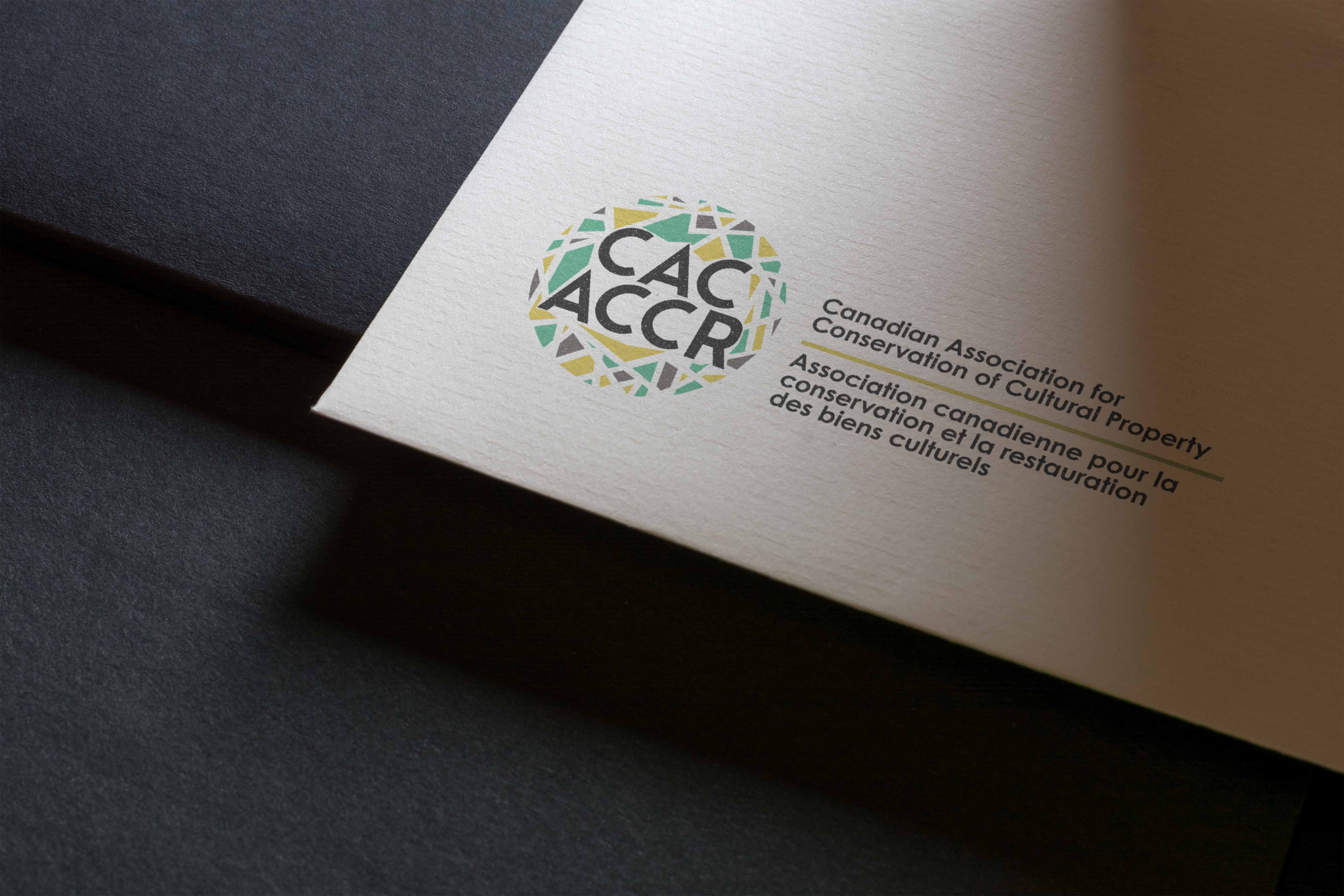
The central design challenge was inclusion at the identity level.
Any symbol tied too closely to one discipline, material, or conservation specialty risked excluding part of the membership. A paintbrush, textile reference, artifact shape, or architectural detail might have represented one group clearly while leaving others feeling secondary.
The solution was to make multiplicity the concept itself. Fragmented colour shards enclosed within a circle became a way to represent many disciplines held together within one unified professional community. The mark suggests range, precision, and shared purpose without privileging one conservation specialty over another.
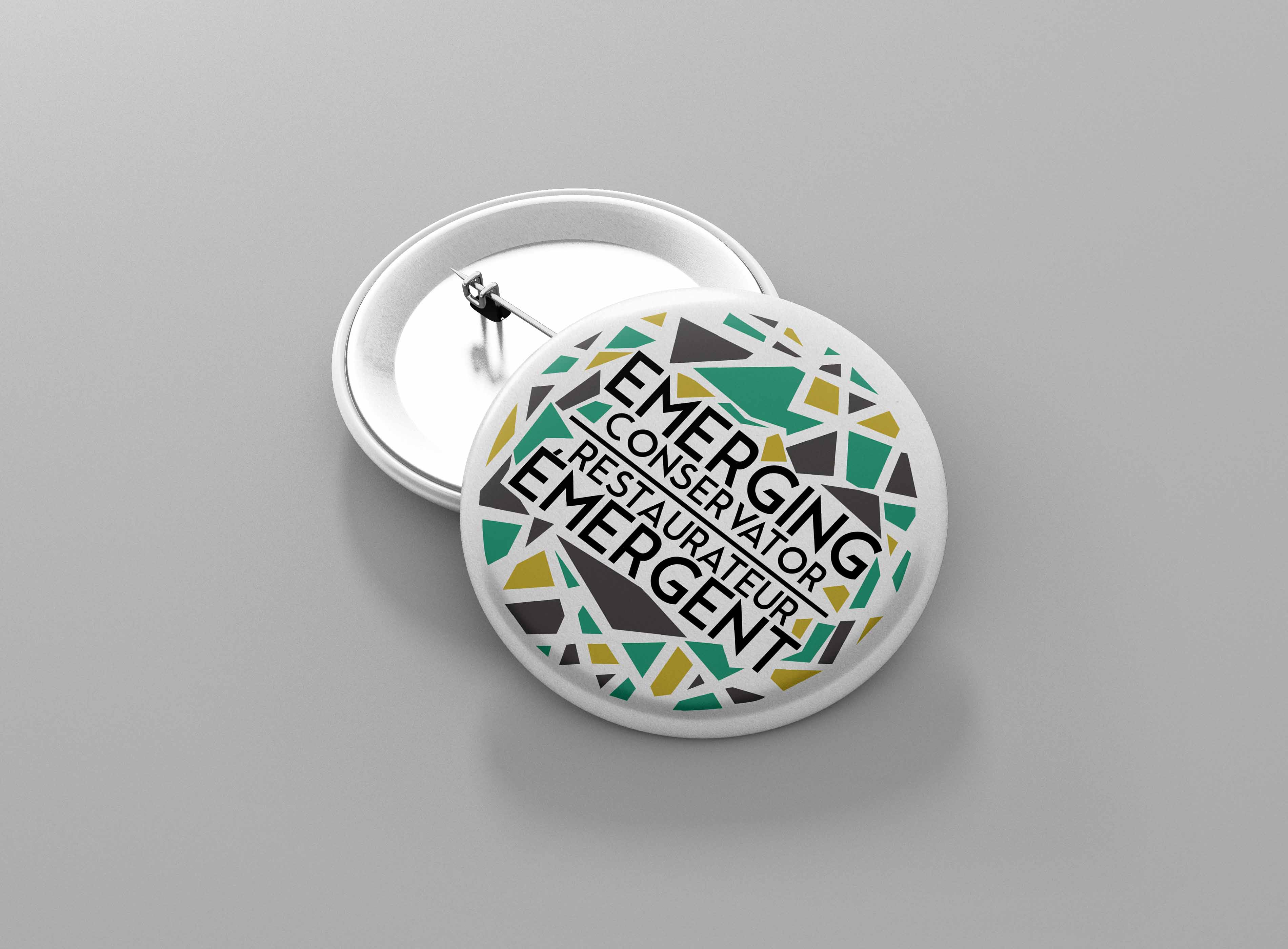
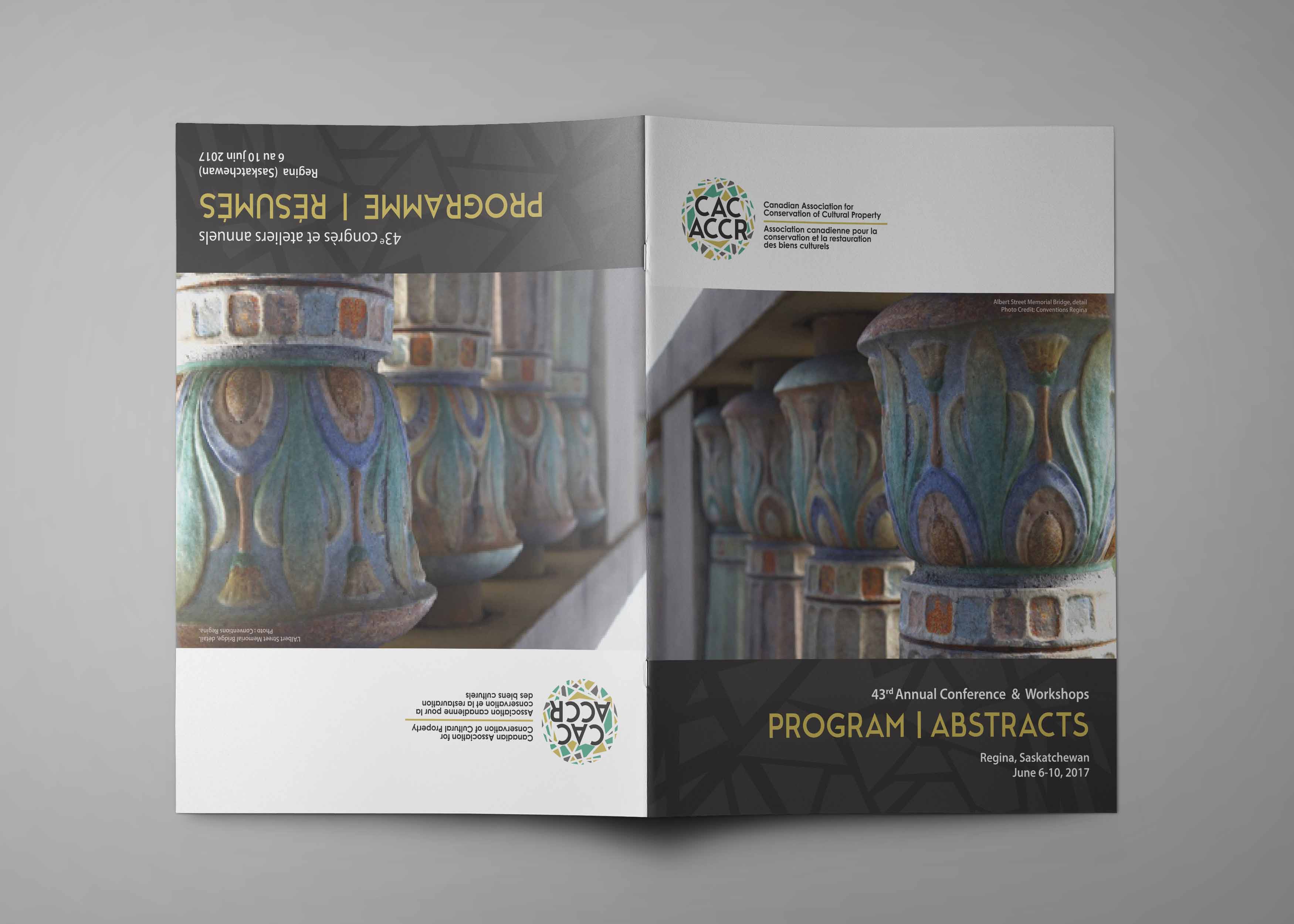
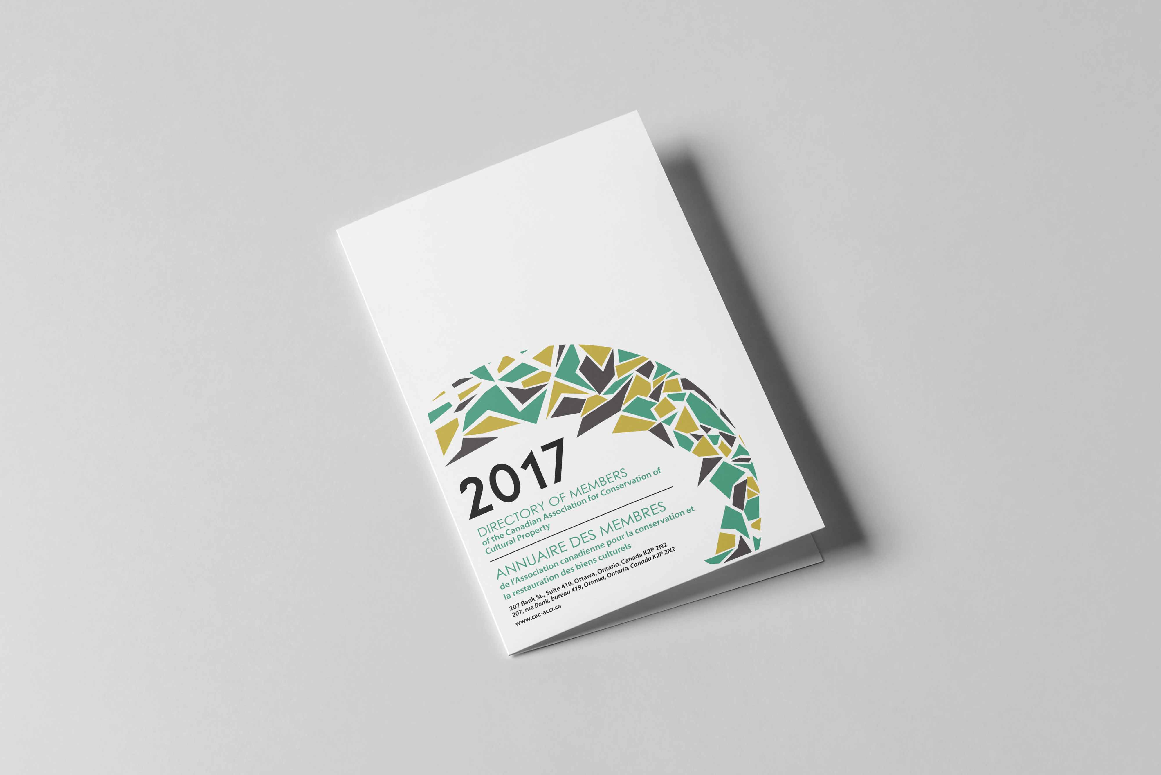
The bilingual logo system required careful planning from the outset. French and English text can vary significantly in length, creating spatial challenges in a mark that needs to feel balanced and intentional in both languages. The identity system was built to account for those differences from the beginning, rather than treating the French version as a secondary adaptation.
That consideration shaped the structure of the logo suite and supporting materials, ensuring the brand could work consistently across publications, conference materials, digital assets, and annual communications.
What This Demonstrates