Marketing materials
Jule Enterprises Marketing Materials
Client
Jule Enterprises
Industry
Specialist Automotive Restoration
My Role
Sole Designer / Creative Strategist
Location
Canada
The Project
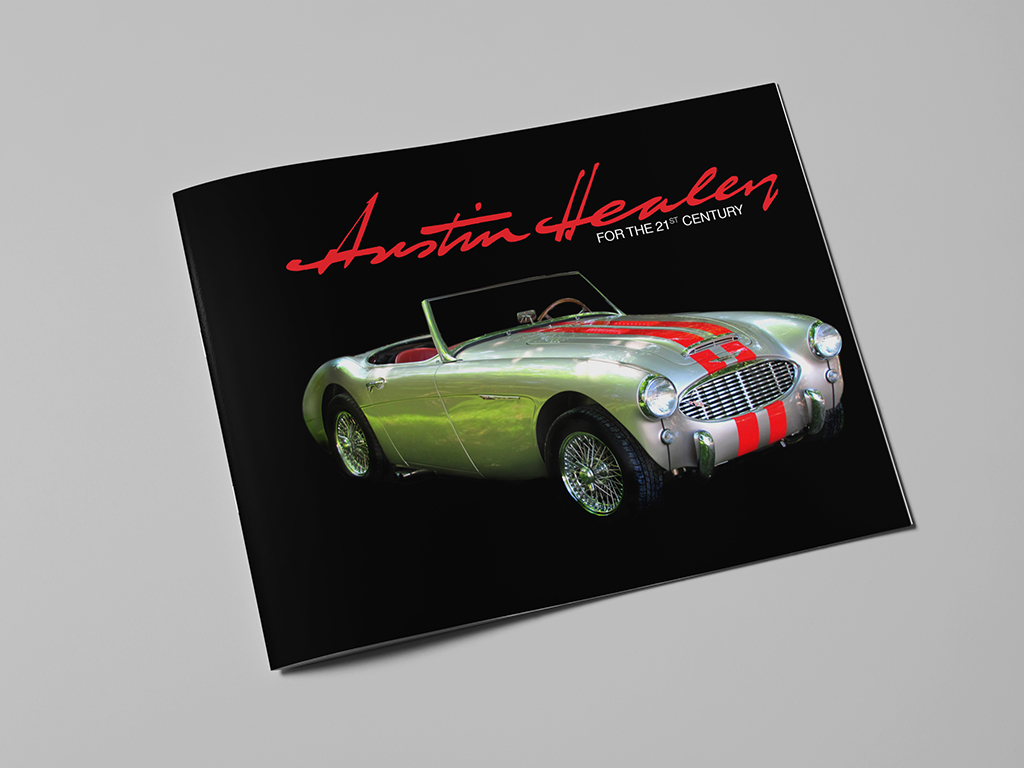
Jule Enterprises is internationally recognized for the meticulous restoration of Austin Healeys, a highly specialized craft serving a discerning global collector audience.
The project required a unified suite of materials across print marketing, website design, and instructional DVD production. Each touchpoint needed to reflect the quality of the restoration work itself: precise, confident, detailed, and built for an audience that understands the value of expert craft.
The goal was to create a visual presence that positioned Jule Enterprises as a specialist authority while preserving the beauty, performance, and collector appeal of the vehicles at the centre of the brand.
The Thinking
The visual direction was built around the appeal of the product itself. Austin Healeys are elegant, high-performance sports cars with a devoted international following, so the design system needed to communicate both technical expertise and emotional desirability.
High-contrast, high-gloss photography became central to the visual approach. The imagery emphasized the shape, finish, and detail of the restored vehicles, allowing the cars to carry much of the emotional impact while the surrounding design reinforced professionalism, restraint, and credibility.
Positioning was a key strategic consideration. The Austin Healey restoration world includes many dedicated hobbyists, but Jule Enterprises needed to signal a different level of authority: seasoned professionals with the technical mastery to handle significant restorations for serious collectors. The design had to communicate that distinction without relying on heavy-handed claims.
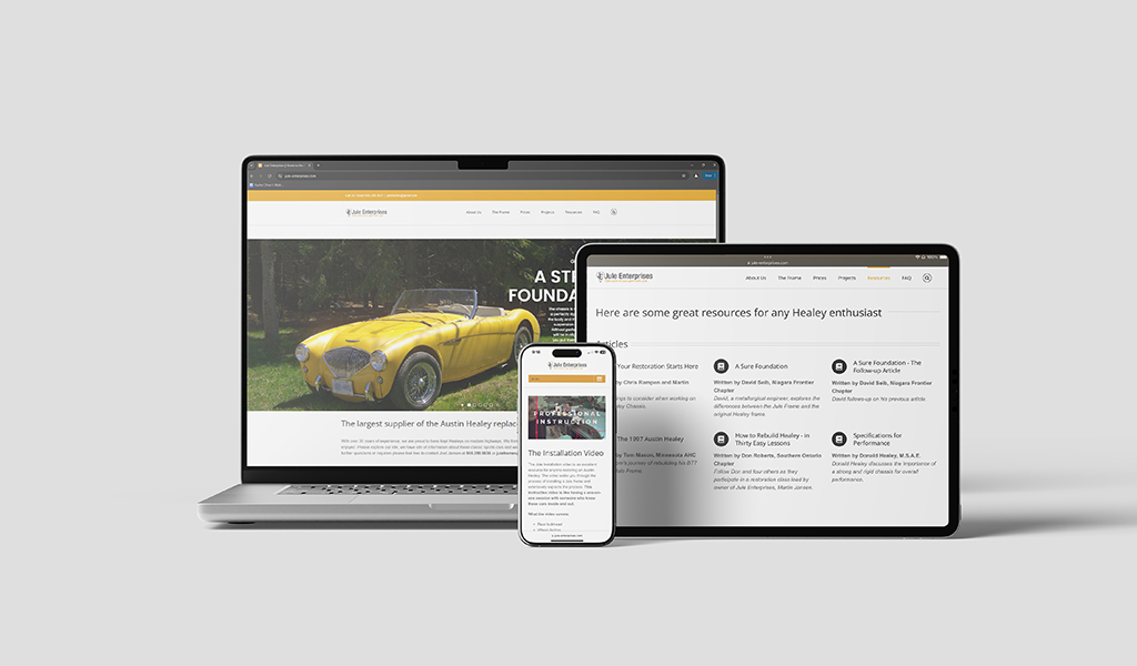
The broader challenge was consistency across very different formats. Print marketing, a modern website with image-led galleries, and instructional DVD content each had their own technical requirements, but all needed to feel part of the same premium brand experience. The resulting system used polished photography, restrained typography, and consistent visual hierarchy to carry the same sense of expertise across every touchpoint.
What This Demonstrates