Case Study
Bowmanville Expansion Project Proposal
Client
Metrolinx
Industry
Transit Infrastructure / Government Procurement
Location
Canada
Timeline
3 months
My Role
Lead Proposal Designer / Creative Lead
Team Context
Embedded within a pursuit team, leading the graphic scope and production workflow.
Scope of Work
Full graphic scope including custom illustrated maps, infographics, icon design, and complete document layout
The Brief
The Bowmanville Expansion Project was a Metrolinx pursuit to extend GO Rail service along the Lakeshore East corridor from Oshawa to Bowmanville. This phase of the process focused on the technical submission, which needed to communicate Kiewit’s delivery approach, technical strategy, and understanding of the project clearly and convincingly.
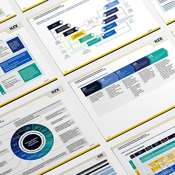
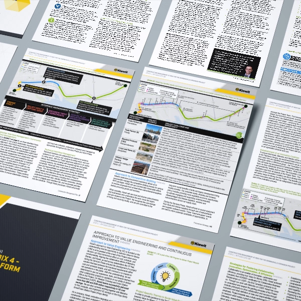
I managed the graphic scope of the submission, including custom maps, iconography, infographics, and proposal layout. Like all government infrastructure proposals, the work had to meet standard formatting and compliance requirements, but the real challenge was finding a visual language that could make a complex project legible without losing clarity or impact.
Design Thinking & Strategy
I came into the pursuit with a strong foundation of trust from the proposal team, which gave me genuine creative latitude. That trust shaped the ambition of the design decisions I was able to make. The work centred on two areas: custom iconography and illustrated mapping.
The icon suite was developed from scratch to support the specific needs of the proposal. Its role was not just visual consistency, but functional clarity. Based on feedback from Metrolinx on a previous pursuit, I had a clear sense of what evaluators were looking for. The icons were designed to draw attention to those points and make key information easier to recognize at a glance.
The mapping approach was the more significant design decision. The original plan relied on satellite imagery from Google Maps, which is common in proposal work, but that approach can quickly become visually crowded. Instead, I rebuilt the maps as clean illustrated graphics by exporting the base map from ArcGIS into Illustrator, removing unnecessary visual noise, and layering in only the information the proposal needed. That gave me far more control over hierarchy, weight, and readability, and made the project easier to understand at a glance.


Process Documentation
Every proposal starts with a blueprint session with the proposal manager. We map the structure, review the requirements, assign space to each section, and build a working framework before design begins. That doesn’t prevent change, but it gives the team a clear starting point, which makes it much easier to absorb addenda and shifting content without losing momentum.
This pursuit also involved moving the team into an InDesign-based workflow for proposal production. I had implemented similar workflows before, so part of my role was helping contributors adapt to the process while maintaining the design control and production structure the submission required. It required patience, clear communication, and a steady hand. The team adapted well, and the improvement in design control was evident in the final result.

Challenges & Solutions
The two main challenges on this project were the mapping approach and the InDesign transition.
The mapping challenge was fundamentally about clarity. Satellite imagery with graphic overlays is the default in proposal design because it is familiar and fast, but it is not always the most effective option. Rebuilding the maps as illustrated graphics gave me a cleaner way to present the information and made the project easier to read.
The InDesign transition was a different kind of challenge. Introducing a new production environment to a team used to working in Word required ongoing support throughout the process. Questions about editing access and workflow came up along the way, and they had to be resolved while I was managing my own design workload. Keeping the project moving meant staying organized, communicating clearly, and making sure the system held together under pressure.
Working as the sole designer on a pursuit means managing briefs, revisions, and scope changes independently. That is a regular part of proposal work, but doing it well requires strong systems, good judgement, and the ability to triage effectively under deadline pressure.

OUTCOME & REFLECTION
The proposal was well received internally, and the district manager specifically highlighted the maps and sequencing infographics as standout elements of the submission.
The most useful takeaway from this project is straightforward: in proposal work, the best design decisions are not always the ones that make a document look polished. They are the ones that make the content easier to understand. The illustrated maps were a better solution because they communicated more clearly, and that distinction is what makes design genuinely useful in this environment.