Case Study
CFUW Oakville 75th Anniversary Exhibit
Client
Canadian Federation of University Women, Oakville Chapter via Halton Region Heritage Services
Industry
Non-profit / Municipal Heritage
Location
Canada
Timeline
4 months
My Role
Sole Designer
Team Context
Working directly with Halton Region Heritage Services as the coordinating intermediary, with final approval through the CFUW Oakville committee
Scope of Work
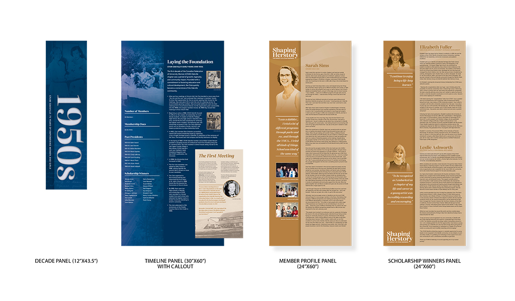
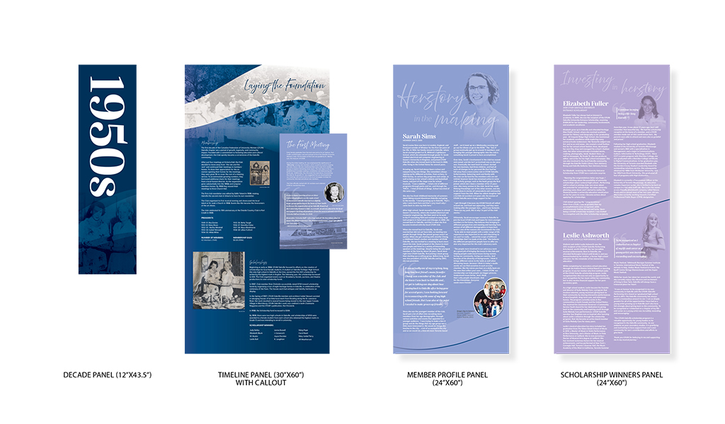
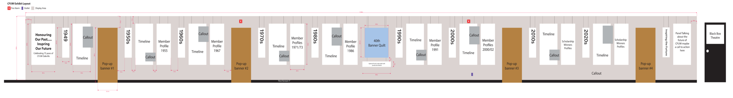
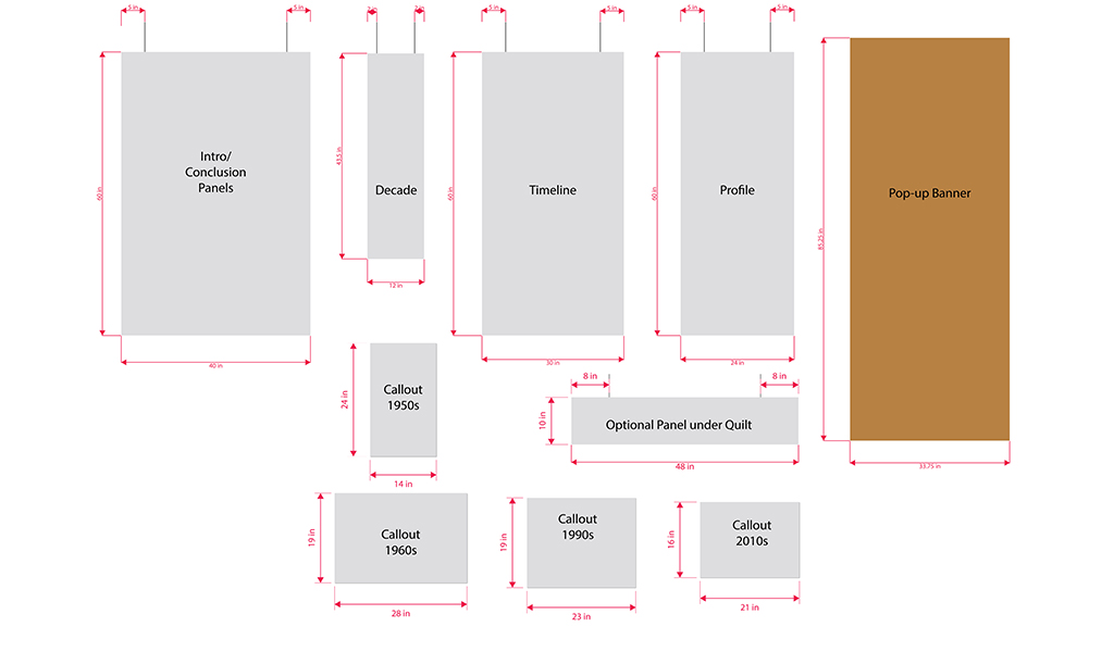
28 large-format timeline panels, 4 pull-up banners, 5 raised callout panels, full spatial planning and exhibit layout.
The Brief
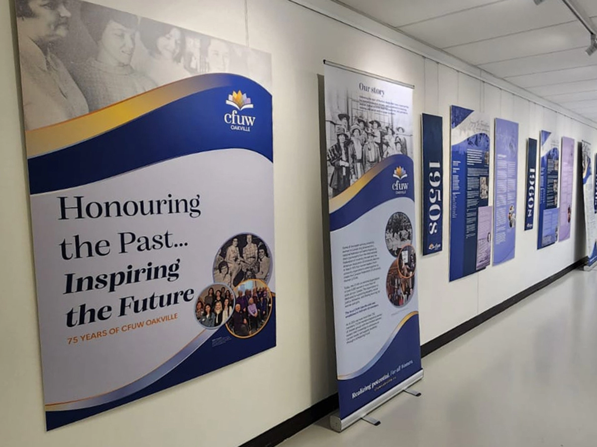
The Canadian Federation of University Women (CFUW) is a national organization dedicated to advancing equality, social justice, and lifelong learning for women and girls. The Oakville chapter marked its 75th anniversary with a commemorative exhibit at QE Park Community and Cultural Centre, designed to celebrate its history, honour its members, and share that story with a broad public audience.
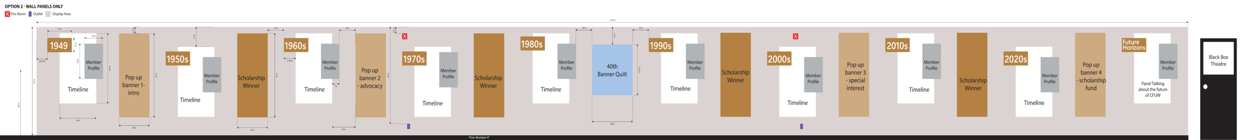
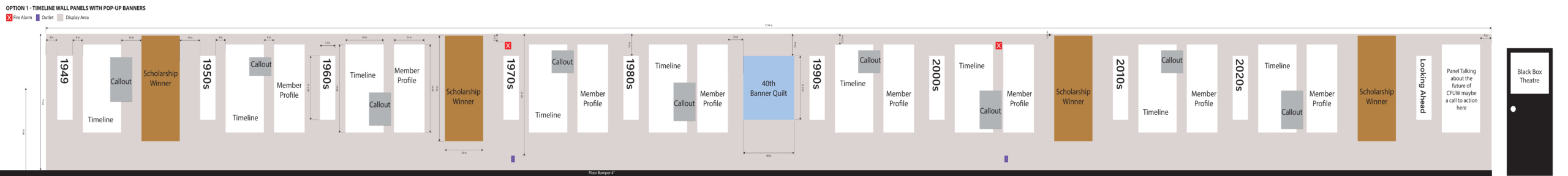
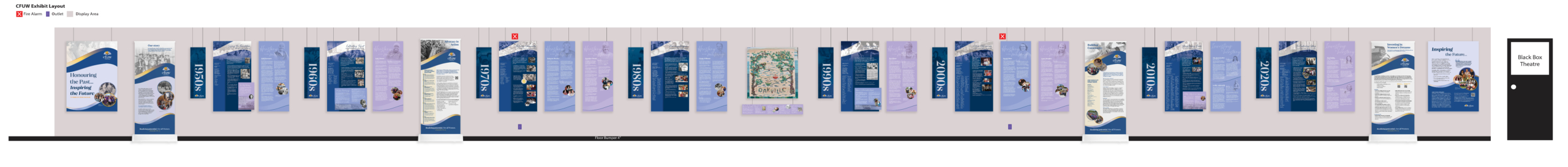
The exhibit had to work within a 94-foot hallway, which made the space itself a major part of the brief. The challenge was not simply to create individual panels, but to figure out how to use that length well so the story could unfold clearly as visitors moved through it.
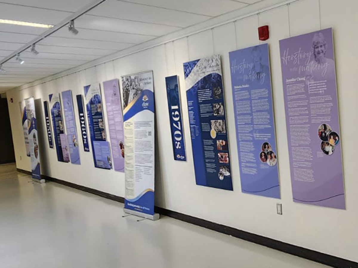
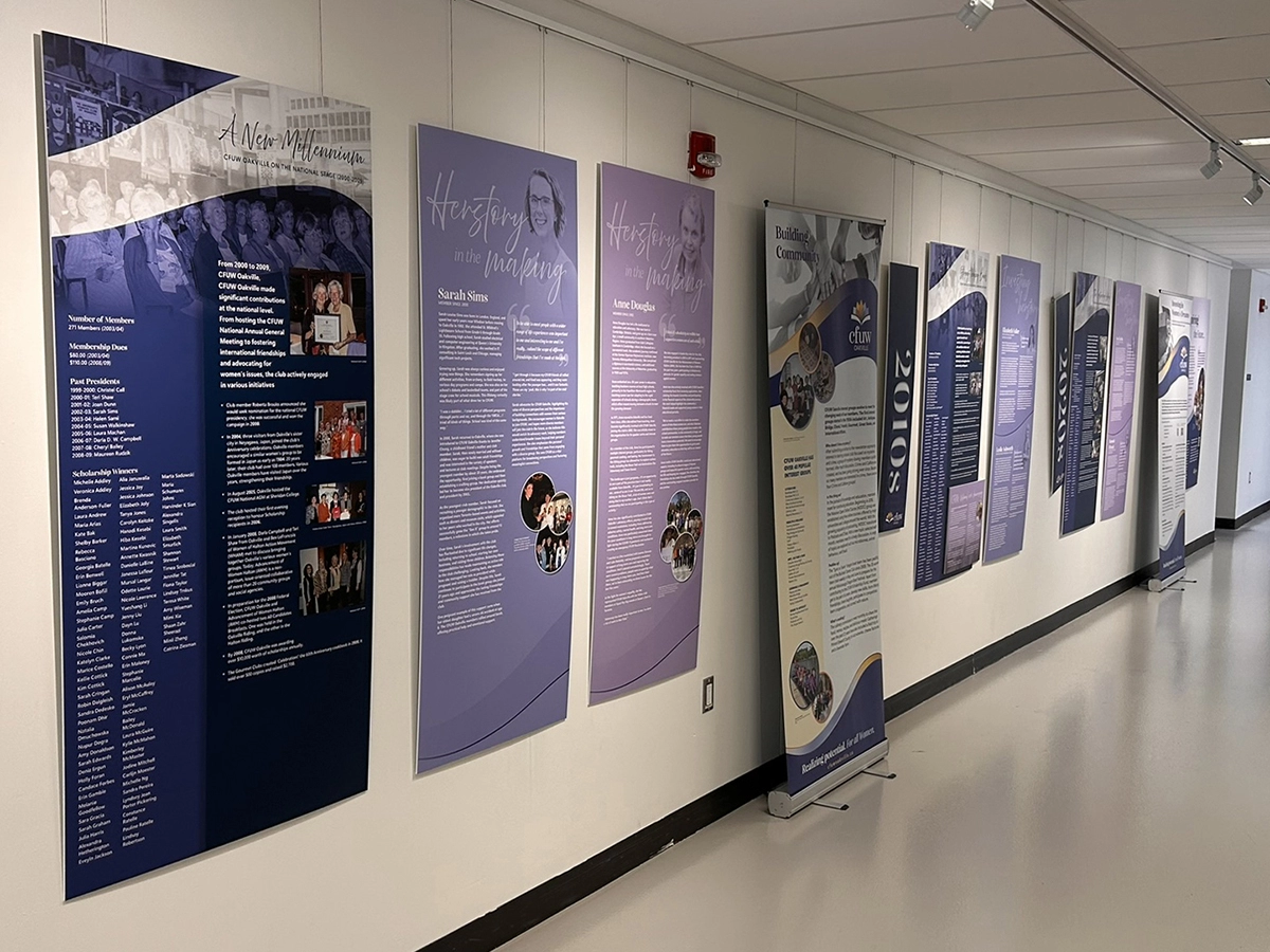
A major part of the design process was deciding how to structure the content. The final approach combined a large timeline with member profiles and raised callouts, creating a strong narrative flow while making room for individual voices and historical detail. The visual language was developed from CFUW’s existing brand guidelines and adapted for exhibition use.
The project required balancing spatial planning, production, accessibility, and public-facing storytelling at a scale that demanded careful coordination from the outset.
Initial Concepts – Layout Planning
Design Thinking & Strategy
The central challenge was threefold: how to tell a clear story across a 94-foot space, how to make each panel work on its own for visitors entering at different points, and how to create enough visual rhythm across the exhibit to keep the experience engaging from end to end.
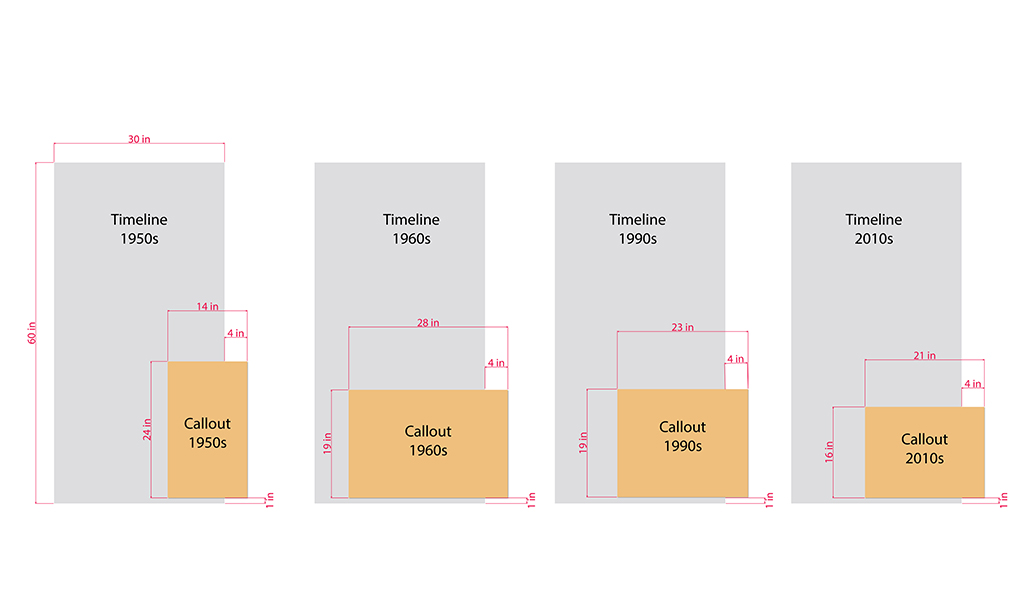
That meant thinking about the exhibit as both a single narrative and a series of individual reading moments. The timeline carried the overall structure, while the member profiles and raised callouts created points of focus within it. Each panel type had to feel distinct enough to be useful, but consistent enough to read as part of the same system.
I also had to work with a historical archive that varied widely in image quality, from strong portraits to scans that were far below print-ready resolution. That shaped the design approach from the beginning, since the image treatments needed to work across the full set of panels without drawing attention to the limitations of the source material.
Initial Concepts – Design
Process Documentation
I began with a full spatial mock-up in Illustrator before designing any final panels. That early layout work let me test different panel arrangements, see what could realistically fit in the hallway, and identify which content structures would work best before committing to a full design direction.
From there, I developed two more polished concepts for the client to review, each showing a different way the exhibit could balance the timeline, member stories, and supporting callouts. That step was important because it let us make decisions about structure and pacing early, before spending time on full production artwork.
Once the direction was chosen, I built the exhibit panel by panel, using the mock-up as the guide for hierarchy, spacing, sequencing, and flow. Accessibility shaped the practical decisions as the work developed, including font sizing, typographic hierarchy, and hanging height. Those considerations were built into the design rather than added later.
The archival image work also needed testing. I developed graphic treatments such as halftone fades and layered backgrounds, then produced test prints to check how they would hold up at scale. That was especially important for a project like this, where print quality had to be reliable across such a large number of panels.
The review process ran through Halton Region Heritage Services, with final sign-off from the CFUW committee. Clear version control and organized handoffs were essential throughout, especially as individual panels moved through review and print preparation.
Final Layout and Panel Sizing
Challenges & Solutions
The most distinctive challenge on this project was the space itself. Designing for a 94-foot hallway meant the exhibit had to hold together as one continuous experience, while still giving each section enough clarity to stand on its own. The full spatial mock-up solved that by giving everyone a shared reference point before production began and by helping test what would actually work in the venue.
The second challenge was visual rhythm. With a project of this scale, the exhibit needed different panel types to break up the experience and support wayfinding, but those differences still had to feel cohesive. The timeline, member profiles, and raised callouts were developed as a family of related components, each with its own role in the story.
The third challenge was image quality. The archive contained a mix of strong and weak source material, so I developed graphic treatments that could elevate lower-resolution images without making them feel like a compromise. Test prints were an important part of that process, since the treatments needed to hold up at large format and across different panel types.

OUTCOME & REFLECTION
The opening reception drew close to 90 members and guests, and the response was enthusiastic. Members were proud to see their organization’s history presented with care and clarity, and the exhibit was described as first-class by the organizing team.
Working closely with the Halton Region Heritage Services team gave me access to expertise I did not have in-house, and that collaboration made the final result stronger. For me, that is a core part of senior design practice: knowing when to rely on other specialists, and knowing how to translate their input into a solution that feels clear, cohesive, and well considered.