Case Study
The Crossing — Community Event Branding
Client
Halton Region Heritage Services / Town of Oakville
Industry
Municipal Government / Community Heritage Events
Location
Canada
Timeline
Ongoing since 2023. Initial project: 2 months
My Role
Sole Designer
Team Context
Working directly with Halton Region Heritage Services and the organizing team at Knox Presbyterian Church Sixteen, reporting to a small committee
Scope of Work
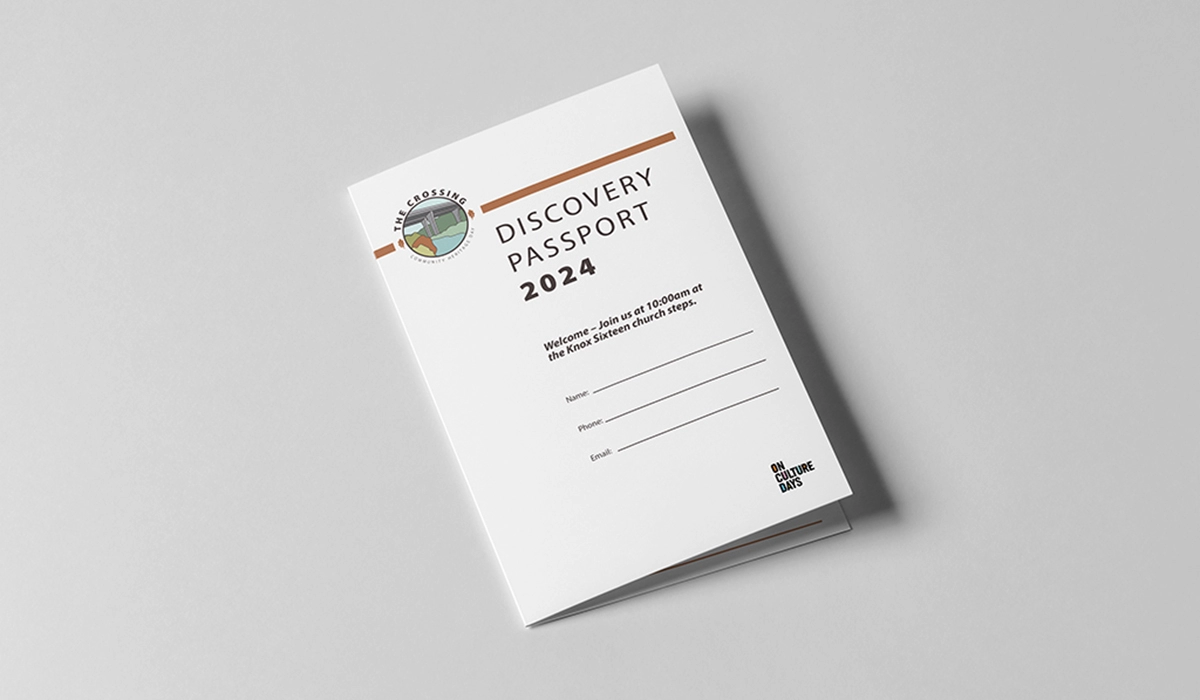
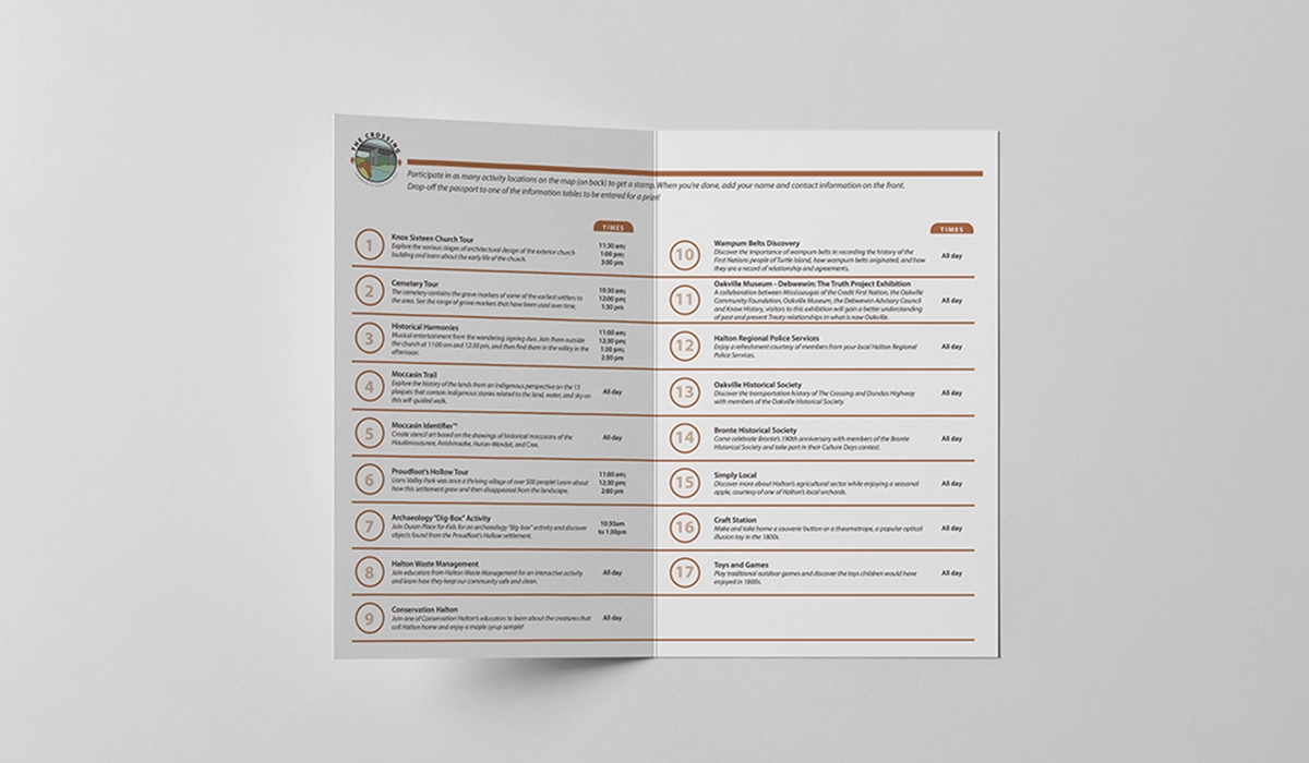
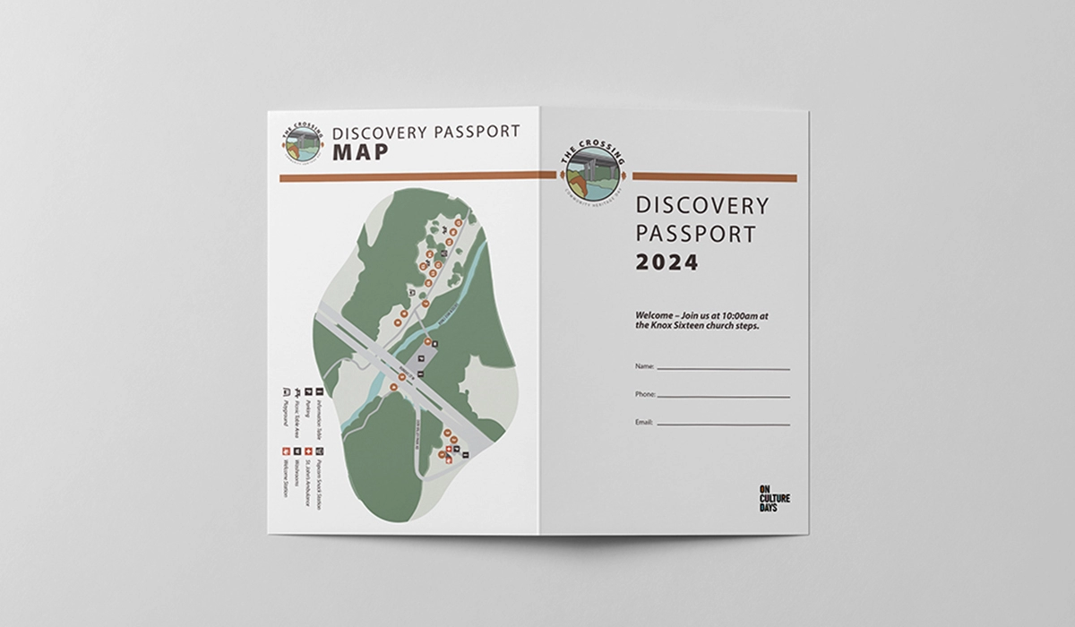
Logo design, event identity system, illustrated map, annual event materials including signage, posters, postcards, social media assets, and activity cards
The Brief
The Crossing is an annual community heritage event held at Lions Valley Park in Oakville, as part of Canada’s Culture Days initiative. The event invites the public to explore the historical significance of the site.
The initial identity needed to reflect that sense of place while also building recognition over time. The brief was rooted in the landscape itself — the valley, the Sixteen Mile Creek, the bridge, and the colours of fall. It needed to feel specific and welcoming, with enough flexibility to support the event year after year.
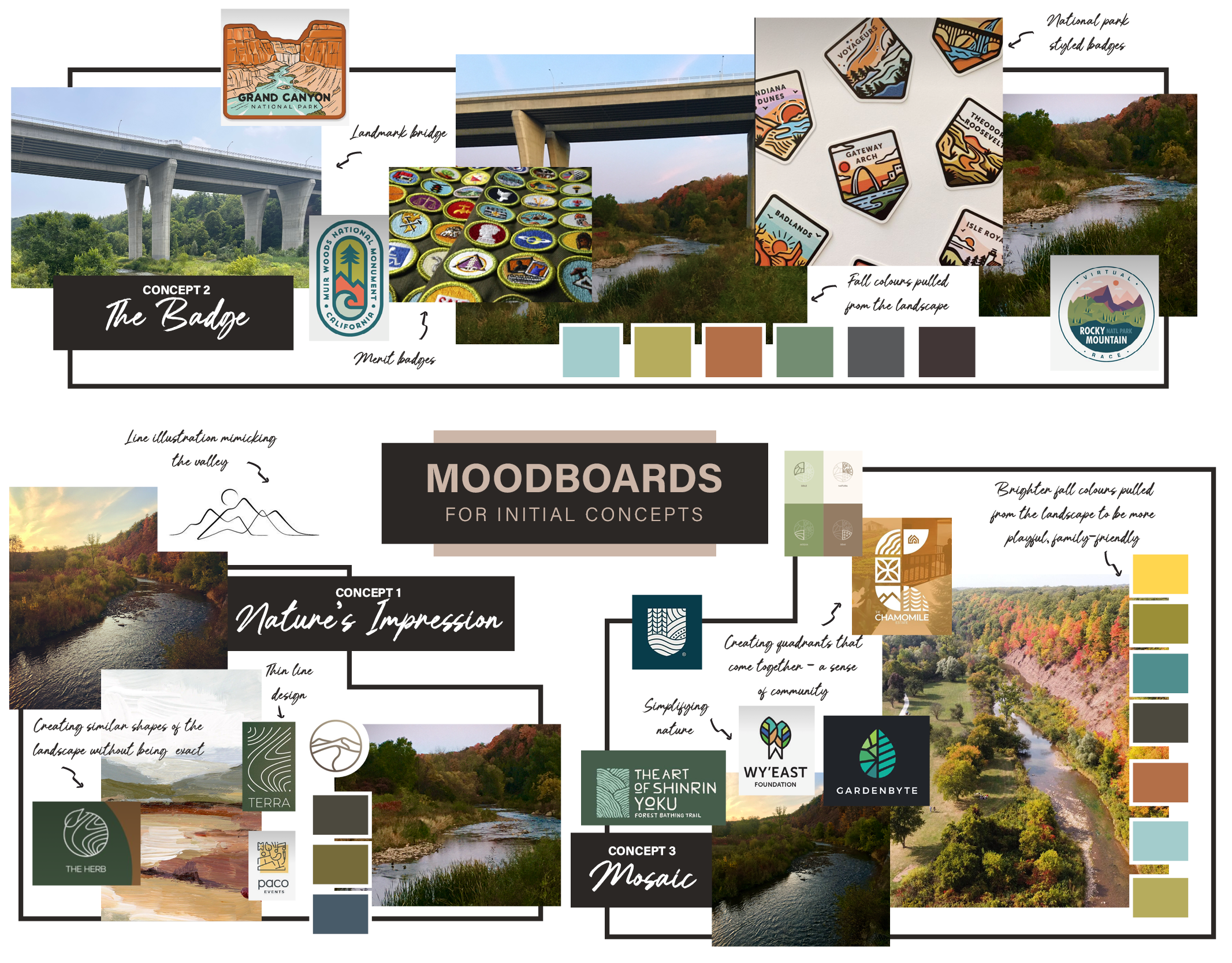
Concept 1
Concept 2
Concept 3
Design Thinking & Strategy
The central question was how to create an identity that felt specific to the site while still working for a broad family audience, including people arriving without much background in the history of the place.
To explore that, I looked at community event branding and national park identities. Both need to communicate a clear sense of place while remaining open and accessible, which made them useful reference points for this project.
From there, I developed three initial concepts — a badge, a mosaic, and a nature-inspired direction — to give the committee a range of options. The badge concept came through most clearly. It offered a familiar, collectible quality while also carrying associations with scouting, outdoor learning, and community gatherings — ideas that naturally suggest nature, discovery, and belonging.
Process Documentation
The approval process involved a small committee, with Halton Region Heritage Services ultimately advocating for the badge direction. It had the strongest connection to the bridge illustration and best reflected the heritage tone of the event. The final mark required relatively little revision.
Once the identity was approved, the ongoing process became one of maintaining consistency year after year. I updated the supporting materials each season — including signage, digital flyers, email blasts, social media assets, and the activity passport — while keeping the core logo intact. That approach made it easier to refresh the event without losing recognition.
Working directly with Halton Region Heritage Services and the organizing team at Knox Presbyterian Church Sixteen also required steady communication. The two groups brought different priorities and levels of design familiarity, so part of the process was keeping everyone aligned as the materials evolved. That clarity has been an important part of sustaining the relationship.
Challenges & Solutions
The main challenge was tone. Community heritage events need to feel welcoming and approachable without becoming generic, and grounded in place without feeling exclusionary. The identity had to strike that balance carefully.
The badge solved that well. It carries associations with the outdoors, community, and exploration, while the custom bridge illustration gives it the specificity it needed to feel connected to Lions Valley.
The recurring nature of the event adds another layer of discipline. Each year, the materials need to be updated accurately and efficiently, with new dates, program details, and signage changes folded in without disrupting the system. That kind of stewardship depends on consistency, attention to detail, and a clear understanding of how the identity needs to function across every format.


OUTCOME & REFLECTION
The branding has been well received by the organizing committee, and the relationship has continued through three consecutive years of the event. Beyond the original client, other community leaders in the area have also reached out about similar branding for their own events, which speaks to the strength of the identity and its resonance within the broader community.
This project is a good example of the value of listening closely to what makes a place distinct, then translating that into a visual system that is simple, durable, and easy for people to connect with.